Table Of Contents
What Do You Mean By Waterfall Chart in Excel?
A waterfall chart in Excel is also known as a bridge chart in Excel, a special type of column chart used to show how the start position of a certain data series changes over time, be it growth or decrease. The first column in the waterfall chart is the first value, while the last column in the waterfall chart is the final value. In total, they represent the total value.
Explained
They introduced the waterfall Excel chart in 2016. The chart demonstrates how the value increases or decreases through a series of changes. By default, the positive and negative values are color-coded. Unfortunately, the waterfall chart type is not present in 2013 or earlier versions of Excel. However, in this article, you will also learn how to create a waterfall chart if you are using an older version of Excel.

Uses of Excel Waterfall Chart
A waterfall chart is widely used to visualize financial statements, compare earnings, and analyze sales or product value over time. It is also used for analyzing profit and loss and visualizing inventory. They became popular in the late 20th century when McKinsey & Company first presented them in a presentation to their clients.
How to Create a Waterfall Chart in Excel 2016?
For example, you want to visualize the data on a waterfall chart.
You can select cells A3:B14, click on the "Chart Type," and select the "Waterfall" chart.

A waterfall chart for this data will look like this:

The chart will show the revenue generated in each month of the year.
You can also build a similar chart using older versions of Excel. Let us see how.
First, create five columns A:E – (1) Months (2) Decrease (3) Increase (4) Revenue.
The “Start” value will be on the 3rd and the end on the 16th, as shown below.

For the "Decrease" column, use the following syntax:
= IF( E4 <=0, -E4, 0) for cell C4 and so on.

For the "Increase" column, use the following syntax:
= IF( E4 >= 0, E4, 0) for cell D4 and so on.

For the "Base" column, use the following syntax:
= B3 + D3 – C4 for cell B4 and so on.

The data will look like this:

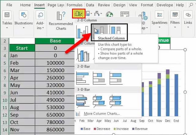
Now, select cells A2:E16 and click on "Charts."

Click on "Column" and plot a Stacked Column chart in excel.

The chart will look like this.

Now, you can change the color of the "Base" columns to transparent or no fill. The chart will turn into a waterfall chart, as shown below.

Create a Waterfall Chart in Excel Older Versions 2007, 2010, 2013
Suppose you have the net cash flow for your company for each month of the year. Now, you want to see this cash flow over a waterfall graph for better visualization of cash flow throughout the year and see which period faced the most crisis. The net cash flow data is shown below.

To plot this chart, select the cells B3: C16 and click on the waterfall chart to the plot.

If you have an earlier version of Excel, you can use an alternative method to plot.
Firstly, make five columns: "Time," "Base," "Decrease," "Increase," and "Net Cash Flow," as shown below.

Now, fill in the details for the "Start." The "Base" value will be similar to Net Cash Flow," "Decrease," and "Increase" will be 0.

For Jan, it will give the increase as:
= IF ( F23 >= 0, F23, 0) for cell E23.

For Jan, the decrease will be given as:
= IF ( F23 <= 0, -F23, 0) for cell D23.

For Jan, it will give the base as:
= C22 + E22 – D23

Now, drag them to the rest of the cells.

Now, you can select the cells B21: E35 and click on Charts -> Columns -> 2D Stacked Column.

The chart will look like this.

Once the chart is prepared, you can set the base fill to "No Fill." You get this chart, as shown below. Also, you may change the color of the start and end bars.
You can adjust the thickness of the bars and gaps in between for better visualization using the following steps.
Right click on the chart -> Select "Format Data Series" -> Decrease Gap Width.

Now, finally, your chart will look like this.

The chart shows the "Net Cash Flow" increase during the year. The "Net Cash Flow" was maximum during July. However, during Aug – Sep, the decrease was huge.
Pros
- The waterfall Excel chart is simple to create in Excel 2016+.
- Good visualization of change in values over time.
- Good visualization of negative and positive values.
Cons
- The waterfall graph type has limited options in Excel.
- This chart becomes cumbersome when using a 2013 or lower version of Excel.
Things to Remember
- It shows a cumulative effect of how the sequentially introduced affect the final value.
- It is easy to visualize positive and negative values.
- It is a built-in chart type in Excel 2016.

