Table Of Contents
Excel Surface Chart (Plot)
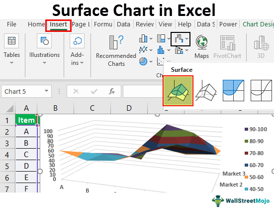
A surface chart is a three-dimensional Excel chart plots the data points in three dimensions. You can see the mesh kind of surface, which helps us to find the optimum combination between two types of data points. A typical surface chart consists of three variable data points. Let us call them "X," "Y," and "Z." From these available three variables, we can categorize them into two sets: independent and dependent variables. Two variables will be independent, and one will be the dependent variable.

So, in such a way, the surface chart shows the relationship between data points through the mesh surface.
Examples to Create Surface Chart (Plot) in Excel
Example #1
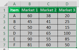
Consider the below data to create your first-ever surface chart in Excel.
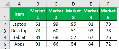
Follow the below steps to create an Excel surface chart:
- Open the excel spreadsheet first.
- Then, copy the above table of data to one of the worksheets. And choose the data range.

- Choose the "INSERT" option in the ribbon tab.
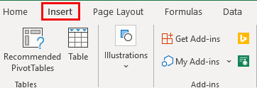
- Under the "INSERT" tab, we can see the "Chart" section. Choose "Stock," "Surface," or Radar Chart in excel in this section. Under this category of charts, choose the "3-D Surface" chart.
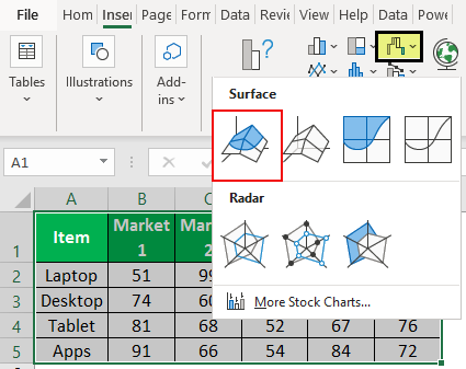
- As soon as you click on the "3-D Surface" chart, you will see the below default surface chart in your worksheet.
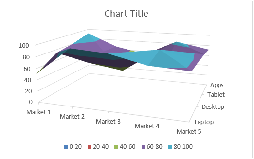
- This is not the final end-user surface chart. We need to customize the chart to view this much better.
Select the chart and press the shortcut key "Ctrl + 1" to open up the "FORMAT CHART AREA" to the right of the Excel spreadsheet (Excel 2013 onwards).
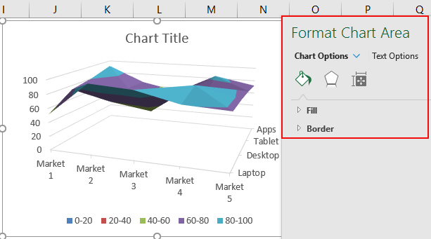
- From that FORMAT CHART AREA, we can change the color of the mesh, horizontal and vertical axis customization, and do many more things.
To change the color of the mesh, you can do this under the "DESIGN" tab itself. By selecting the chart, you can see two chart tools tabs, "Chart Design and Format."
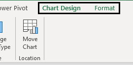
- Choose the "Chart Design" tab, "Change Colors," and choose the color at your convenience.
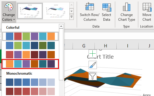
As you can see, we have chosen the fourth one. Finally, we can see the preview of my chart on the right side. Like this place, a cursor on each color set previews the chart before finalizing the color combination. - The next thing we need to do is to "Switch Row/Column." Because at the time of insertion of the chart, Excel assumes horizontal things are data series and vertical things are categories.
So, we need to change the row/column under the "Chart Design" tab.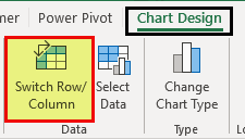
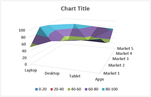
As soon as you select this option, our chart will change automatically. Now, it looks like the one below.
Example #2
Now, let us look at one more example of the surface chart. For this, consider the below data set.

Copy the data to a worksheet.
Select the data to choose the insert chart option.

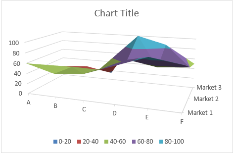
Now, we can see the chart below.
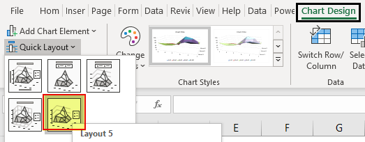
Now under the "Design" tab, choose "Quick Layout" and select "Layout 5."
Now, our chart looks like this.
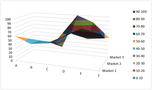
Like this, we can create a mesh surface chart in Excel.
Things to Remember
- The surface chart is not the most often used chart in the practical world, so you will not find so many resources to work with it.
- We must always choose a different color combination to give visual effects.
