Table Of Contents
What Is Stem And Leaf Plot?
A stem and leaf plot refers to a method that involves arranging and representing data, showing the frequency with which different data values occur. Individuals and organizations can utilize this technique to categorize continuous or discreet variables. Moreover, it can help one organize data as they accumulate the information.
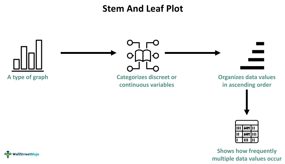
This graph splits a number into a couple of components — stem and leaf, and displays ordered numerical data. While this graph offers group data’s pictorial representation, it can also provide a modal representation as one can determine the model through a visual inspection quickly. The graph offers a straightforward way of summarizing a data set gauged on an interval scale.
Key Takeaways
- A stem and leaf plot refers to a diagram or graph that makes it straightforward for people to know the frequency of various data values. One can categorize discreet or continuous variables using this plot.
- A key stem and leaf plot characteristic is that it has a vertical line, segregating data values into two parts, which are the stem and the leaf.
- Some noteworthy stem and leaf plot benefits are that this type of graph can help identify outliers and help understand the data shape.
- Histograms do not show original data, unlike these plots.
Stem And Leaf Plot Explained
Stem and leaf plot refers to a special table that allows one to organize numerical data on the basis of the numbers’ place values. Every number gets split into a couple of parts. This technique helps present quantitative data in a graphical format.
Let us look at some key stem and leaf plot characteristics to understand this concept better.
- All numbers are broken into a leaf and a stem. The stem is on the left side, while the leaf is on the right side.
- A number’s stem includes everything but the last digit.
- This type of graph resembles a bar chart.
- The number’s leaf is always a single digit.
- It usually utilizes whole numbers. Any number with a decimal point is rounded off to the closest whole number.
- This type of diagram shows the spread of the data.
Additionally, such a special table typically has a key at the end, showing the example of a stem and a leaf, for example, 5|5 and what they represent, like 5.5 or 55.
One can notice trends in data using such a plot. Moreover, it allows one to visualize the data shape, for example, uniformly distributed, right or left-skewed, or random.
How To Make?
One can follow these steps to make such a graph.
- Observe the data to find the total number of digits. Categorize them as 3 or 2 numbers.
- Fix the plot key. For example, 19|4 is 194, and 2|5 is 25.
- Take into account the first digit as the stem and consider the last digit as the leaf.
- Determine the data range, which is the highest and lowest value among the given data.
- Draw a vertical line and ensure to place all stems on the left and all leaves on the right side of that vertical line.
- After listing all the stems in the relevant column, sort the same in ascending order.
- List all leaf values in the relevant columns against the stem in ascending order horizontally.
How To Read?
The key to such a plot help understand data values. One can find the stem and the leaf on the left and the right, respectively. If we combine the leaves and the stems, we can obtain the data values. Suppose we interpret the data below after observing the stem and leaf plot.
| Stem | Leaf |
|---|---|
| 0 | 134 |
| 1 | 47 |
| 2 | 69 |
In the above table, one can observe that the stem column is on the left while the left column is on the right. If one locates stem 2, its corresponding leaf numbers are 6 and 9. Stem 2 means 20, while the leaf means 6 and 9. After combining the stem and leaf values, one can get data values 26 and 29. Next, the numbers in the leaf column against the stem 0 are 1, 3, and 4. Hence, in this case, data values are 1, 3, and. 4.
Examples
Let us look at a few stem and leaf plot examples to understand the concept better.
Example #1
Suppose the table below shows the number of T-shirts sold by John, a salesman, every day over a period of 7 days.
| Day | Number of T-shirts |
|---|---|
| 1 | 17 |
| 2 | 5 |
| 3 | 21 |
| 4 | 14 |
| 5 | 19 |
| 6 | 22 |
| 7 | 8 |
John can present the data utilizing a stem and leaf plot. So, he first arranges the data in ascending order —
5, 8, 14, 17, 19, 21, 22
Then, he selected the stem and the leaves. Since the data values ranged from 5 to 22, he utilized the tens and ones digits for the stem and the leaf, respectively. After that, he wrote the stems and the leaves on the left and right sides of a vertical line in this manner:
| Stem | Leaf |
|---|---|
| 0 | 5 8 |
| 1 | 4 7 9 |
| 2 | 1 2 |
Key: 2|5 = 25
Example #2
Suppose Harry made a survey on customers’ ages at a bookstore on a certain day. From his observations, the highest and lowest ages were 62 and 11, respectively. In this case, data values did not exceed two digits. Hence, for Harry, a natural way to divide the data value involves selecting the leftmost and the rightmost digits as stems and leaves, respectively. In the case of any toddler, he could place a zero to the left. Hence, 2 years will be 02 years. Also, this way, Harry could represent 61 years as 6|1.
First, he arranged the stems into a column. He needed 7 stems in this case, as the highest age was 61.
| Stem | Leaf |
|---|---|
| 0 | |
| 1 | |
| 2 | |
| 3 | |
| 4 | |
| 5 | |
| 6 |
Next, he can place every leaf with the corresponding stem to show how many customers of what age visited the bookstore.
| Stem | Leaf |
|---|---|
| 0 | 5 6 7 |
| 1 | 1 1 2 3 3 4 5 5 5 6 7 8 8 |
| 2 | 1 22 3 4 5 5 5 6 6 7 8 8 9 |
| 3 | 3 4 5 6 6 6 7 7 8 9 9 |
| 4 | 2 2 5 6 |
| 5 | 1 3 3 5 5 9 9 9 |
| 6 | 1 |
Note that 4|2 means 42.
Advantages And Disadvantages
Let us look at the benefits and limitations of this kind of graph.
Advantages
- It shows the original data.
- The data are grouped in this method.
- Individuals can see the distribution’s shape if they use this method.
- Another key stem and leaf plot benefit is that they help people determine outliers.
Disadvantages
- It can be a tedious method.
- Such graphs are a challenge to manage for large sets of data.
Stem And Leaf Plot vs Histogram
Individuals new to graphs often find stem and leaf plots and histogram or bar graphs confusing as they have some resemblance. That said, one can clearly understand their meaning and avoid confusion by knowing their critical differences. Hence, this table shows the differences between the two concepts.
| Stem And Leaf Plot | Histogram |
|---|---|
| Such graphs display original data. | Histograms do not display original data. |
| It is suitable for a small data set. | This graph is suitable for large data sets. |
| This graph shows individual data points. | Histograms do not show individual data points. |
