Table Of Contents
What Are The Sparklines In Excel?
Sparklines in Excel are like a chart in a cell itself. They are tiny visual representations that show the trend of the data, increasing or decreasing. So first, we need to select the cell where we want the Sparkline to insert a Sparkline. Then, in the “Insert” tab in the “Lines” section, click on “Sparklines”. After that, we can choose any one of the styles of Sparklines.
For example, we have the profit and loss data for the first two-quarters of 2 sellers. We will visualize the trend of profit or loss they make in two quarters which can be done by inserting the Excel Sparklines, here “Column Sparklines” from the “Insert” tab, for each seller, as we cannot do this with the help of a single traditional chart.

Once we insert the Column Sparklines, we will get the output shown above, i.e., the Profit/Loss trend for each seller individually.
Key Takeaways
- The Sparklines in Excel help users represent the values in a dataset within a cell pictorially in the form of Bars, Lines, etc.
- Sparklines are most useful when multiple charts are required to represent the data. It is because the chart will take up most of the spreadsheet space. We can save this space by using Sparklines in Excel.
- The location to create a chart is not asked while generating a chart, as a chart is an object. However, Sparkline is not an object and needs a location to insert in Excel.
- So, we must provide the location in the “Create Sparklines” dialog box to create the Sparklines.
- The height and width of the Sparkline depend on the height and width of the cell in which it is inserted. Therefore, the Sparklines look will change if any change is made to the cell’s width and height.
How To Create Sparklines In Excel?
We can Create Sparklines In Excel using 3 different methods, namely:
- Using Line Sparklines.
- Using Column Sparklines.
- Using Win/Loss Sparklines.
The procedure to create the Sparklines in any method is as follows:
- First, select the cell where we want the Sparklines to appear.
- Next, select the “Insert” tab - go to the “Sparklines” group - click the “Line”, “Column”, or “Win/Loss” options, as required, as shown below.

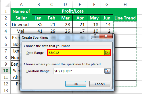
- The “Create Sparklines” dialog box appears. Here, enter the cell range in the “Data Range:” field, and the cell where we want the output Sparklines to appear in the “Location Range:” field, and finally, click “OK”, as shown below.
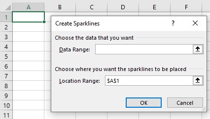
The Sparklines will appear in the Location Cell automatically according to the selected cell range values.
Examples
We will consider some examples to create Sparkline using some of the methods.
Example #1 – Using Column Sparklines
We will create the Column Sparklines, so we must select the column instead of a line, for the seller profit/loss data given below.
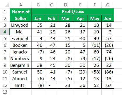
The steps to create a Column Sparkline are as follows:
- First, we must select the “Insert” tab - go to the “Sparklines” group - select the “Column” option, as shown below.

- From the window, enter or select the “Data Range” that has the data.

- Enter the location of the cell where the Sparkline is to be created. It is not usually asked when creating a chart, as a chart is an object. But, Sparkline is not an object and needs a location to insert in Excel.

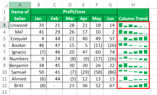
- After the location from where the data has to be picked and the location of a cell in which the Sparkline is to be inserted, is entered, we will get the below Sparkline.

The “Column Sparkline” will look as shown above in column H.
[Special Note: If we have to create a “Line Sparkline” for the same data at this point, then,
- Step 1 is shown below to select “Line Sparkline”, and steps 2 and 3 are the same as in the case of “Using column Sparkline”, which we just saw above.

Since we have selected the “Line” method for creating a Sparkline, the Sparkline will be identical to the “Line” chart, as shown below.
Example #2 – Using Win/Loss
We will create the Win/Loss Sparklines for the seller profit/loss data given below.
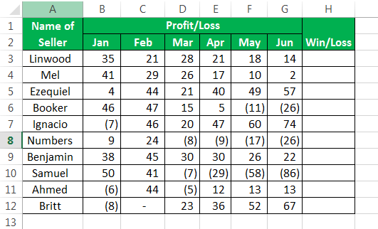
The steps to create a Win/Loss Sparkline are as follows:
Step 1: Select “Win/Loss” from the available “Sparklines” options.

Steps 2 and 3 will be the same as explained before in Example 1.
Step 4: The “Win/Loss” Sparkline will look like the one below.
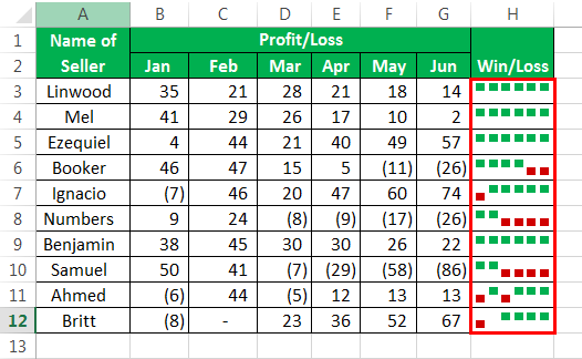
Example #3 – If in case we have Blank cells or zero value cells in the data
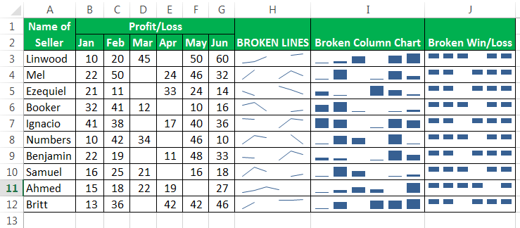
If we have blank cells in the data, the Sparklines will be broken and look separated as below.
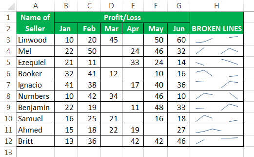
To correct this situation, we need to change how Sparkline treats the empty cell as follows:
Step 1: First, choose any cell on column H, the “Design” tab appears on the ribbon.
Select the “Design” tab - go to the “Sparklines” group - click the “Edit Data” option drop-down, as shown below.
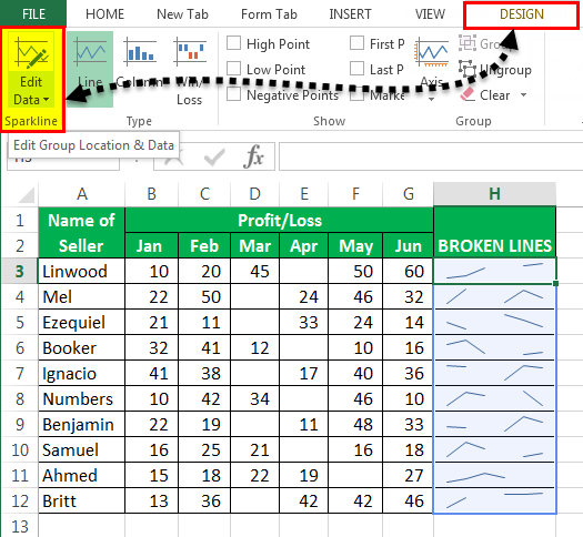
Step 2: From the “Edit Data” option, choose the “Hidden & Empty Cells…” option.
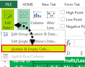
Step 3: We can choose how the gaps will be treated from the available options.
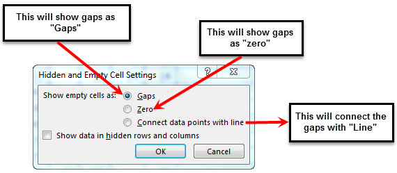
Step 4: Below is how each of the options will treat gaps, such as Zero and Line.
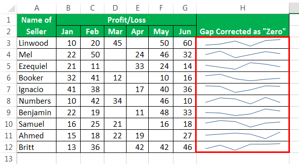
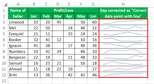
If the data has a gap, it creates broken Sparklines. Follow the same steps of the method (1,2, and 3). Below are examples of broken Sparklines.
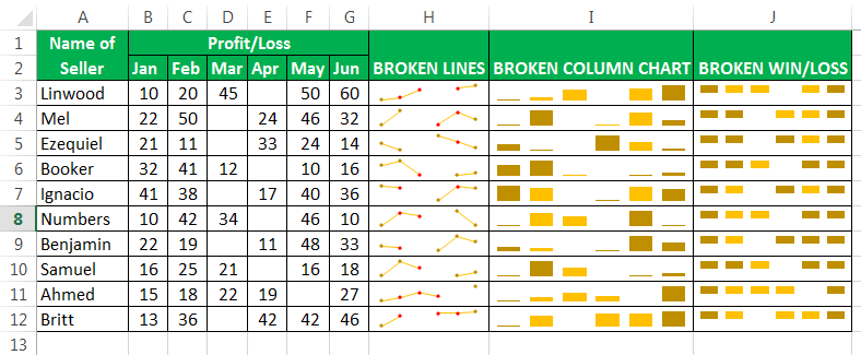
To make “Markers” in the Sparklines, go to the “Design” tab, and click on the option “Markers” after inserting Sparklines.

Then, your marker-added Sparklines would look like this.
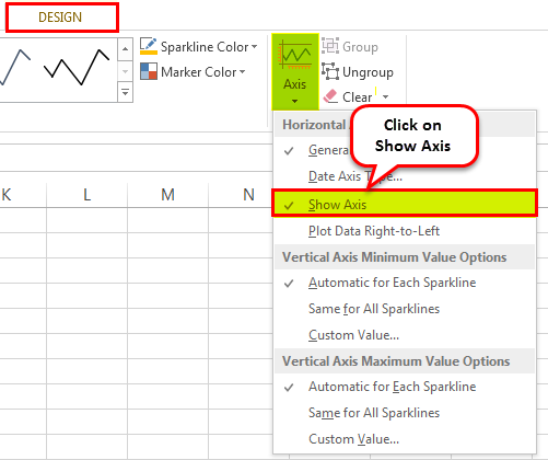
To show the axis in Sparklines, go to the “Design” tab and click on “Axis,” then click on “Show Axis.”
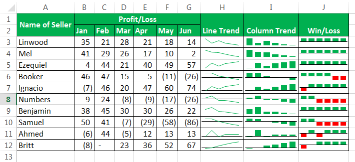
The axis added Sparklines would look as given below.
Explanation
- When we only need the visualization instead of the full features of traditional charts. We should use Sparklines instead of charts as they also have many features that are enough to visualize the data.
- Sparklines work the same as a chart, but the only difference is that Sparklines are inserted in the cell, and a chart is always outside a cell and is an object to Excel.
- Getting started with a Sparkline is easy as this needs the data to be selected and then insert a Sparkline from the ribbon.
- When we create a Sparkline, we have many options about how the Sparklines are to be represented. Hence, we can use lines, columns, or win-loss methods. If we use the line Sparkline, our chart will be identical to the line chart. In the case of the column chart Sparkline, this will match the traditional column chart in excel.
- We should remember that we can use the column and line chart if we have data. However, we need to show the change in the magnitude of that data via Sparkline. We cannot use the “Win/Loss” type if we want to show the importance of change in data, as this type of chart works on the “True” or “False” method only. Therefore, they cannot show a difference in the magnitude of data.
Important Things To Note
- The Sparklines are not an object. Therefore, these are inserted into a cell and not on the worksheet area, as done in the case of charts that are inserted as an object and on the worksheet.
- Even if a Sparkline is created in a cell, we can still type in that cell.
- A Sparkline must be deleted from the menu and cannot be deleted with the click of the “Delete” button.
- We should not use the “Win/loss” method of Sparkline if we need to show the magnitude of change because they represent the “True” and “False” situations.
