Table of Contents
Price Trend Meaning
Price trend refers to the direction in which an asset’s price is moving in the financial market. It is the most crucial concept in technical analysis, and based on this, traders enter or exit trades to earn profits.
It is possible to understand the trend using trendlines or various indicators that point out the price actions related to stocks, bonds, commodities, etc. Indicators create peaks and troughs due to volatility, which indicate the sentiments of the market participants.
Key Takeaways
- Price trend refers to the direction in which the prices of assets, like stocks, bonds, commodities, etc, move in the financial market.
- This trend depends on various factors like demand, supply, political and economic conditions, sentiments and biases of participants, etc.
- Trends are marked by highs and lows that are depicted in a chart, which traders use to make financial decisions and earn profits.
- There are innumerable price action tools and indicators that point out continuation and reversals, which are combined with fundamental analysis for better results.
Price Trend In Stock Market Explained
Price trend is the movement of asset prices in a particular direction based on various factors like demand, supply, political and economic conditions, market sentiments, etc. Traders use these movements to make buy and sell decisions and earn returns.
Depending on the direction, there may be uptrends, downtrends, or sideways trends, which are detailed in the next section of the article on price trend analysis. Different trendlines and some widely used technical indicators identify these directions, along with their strength of movement, based on specific fixed timeframes.
Trends are helpful for both short-term or intra-day traders who want to make quick money as well as long-term investors who wish to fulfill their future financial goals with minimum risk. Therefore, trend analysis, using historical and current data, helps predict the future price trend that can be successfully used not only to earn returns for individuals but also to help corporates frame successful investment and expansion strategies to take the business forward.
This concept of price trend analysis also gives an idea about the financial condition of a country, its level of stability, and its prospects. However, it is essential to grasp the trend concept well so as to make a proper analysis about which is the most profitable investment option available based on one’s financial objective and risk appetite.
3 Directions/Types Of Price Trend
The concept is based on three types of directions: the uptrend, downtrend, and sideways movement. Given below are charts from TradingView that provide a detailed understanding of each.
#1 - Uptrend
An uptrend in a price trend chart means the prices show a clear upward movement. However, the upward movement will not be continuous but will have some minor fluctuations. However, overall, the trend will be upwards if the trader analyzes the chart over a particular timeframe. The candlestick patterns formed will show higher highs and higher lows, which means both highs and lows will occur higher than the previous highs and lows, which are also called peaks and troughs.
The chart below shows a clear uptrend from April to July, where the candles are steadily moving up, with some minor fluctuations denoted by red candles. The overall trend during that time is upward, and traders will prefer to stay in an extended position.

#2 - Downtrend
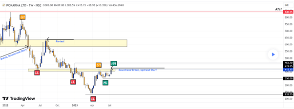
This will be just the opposite of the above case. The candles will show that the prices are moving downwards, with some minor upmoves in between. The overall trend will be down, which is denoted by lower higher and lower lows; that is, every high and low will be lower than the previous one.
In the chart below, the above explanation is clarified. There is a downtrend from July 2022 to April 2023, with lower highs and lower lows, which signifies that prices are falling. At this stage, the trader will either go for a short position or sell off their holdings.
#3 - Sideways
A sideways movement in a price trend chart is when the prices do not show any upward or downward movement but move in a more or less horizontal manner. Such a condition is also referred to as a rangebound market, where the price volatility is much less, and so the market is stable. There is also a lack of direction for the asset.
In the chart given below, the market is moving within a range, with very negligible fluctuations, which is happening within the upper and lower trend lines. Such a market is not suitable for trading, and the traders should wait for a breakout either upwards, above the resistance, or downwards, below the support. Such a breakout, supported by further confirmation using red and green candlesticks, respectively, is the time to plan a trading strategy.
Methods Of Identifying Trends
Here are some commonly used indicators that act as price trend checker and help identify the trend. They are as follows:
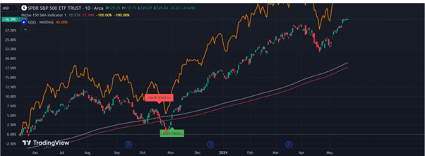
#1 - Simple Moving Average (SMA)
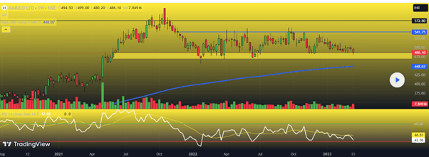
This is the easiest form of moving average and is calculated as the average of the closing prices of the selected periods. It is referred to as the moving average because the average value is plotted bar by bar, which forms a line that moves with the chart as and when the value changes.
In the chart below, the 150-day SMA is visible as a grey line. It shows the overall trend in the market, which is an uptrend in this case. The red line indicates the stop loss levels. When the price action intersects the SMA and crosses above it, there is a buy signal, and when the SMA line intersects below it, it is a sell signal.
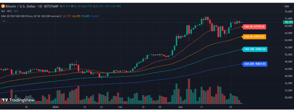
#2 - Exponential Moving Average (EMA)
The exponential moving average is a price trend checker that focuses more on current data, unlike SMA, which gives equal importance to both past and current data. It is helpful to check the trend for only some particular timeframes, which may be 50 days,100 days, or 200 days. However, short-term EMA is given more weight than long-term ones. Usually, traders use a number of EMAs for better understanding because they offer a more detailed view of the relationship between the trends of different timeframes.
The chart points out how the different EMAs appear to the trader and how they are used. As per the chart, if shorter EMAs are above the longer ones, the market is bullish, and the market is bearish if the longer ones are above the shorter EMAs. Crossovers are essential points of entry or exit. Therefore, if a short-term EMA crosses a long-term EMA downwards, that is a signal for a down move with an exit level.
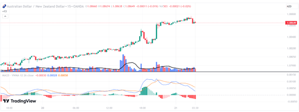
#3 - Moving Average Convergence And Divergence (MACD)
MACD is a price trend indicator that is used in technical analysis to identify trends and their strengths and, based on that, the buy and sell points. It is a lagging indicator, which means it tends to generate the signal after the price action has already started. In its calculation, the value of 26-day EMA is subtracted from the value of 12-day EMA. The MACD (blue line) is combined with a signal line (red line), which is the value of the 9-day EMA of the MACD line.
If the MACD line converges or intersects the signal line downwards, it is a sign of a down move and exit point. If the MACD line diverges or moves away from the signal line and intersects it upwards, then it is a sign of an uptrend. This explanation is visible clearly in the chart given below. However, the chart also shows the volume. Whenever there is divergence, there is also an excellent volume to support it.
Examples
The concept of price trend indicator can be explained using some suitable examples, as given below:
Example #1
James is waiting to invest in the stocks of XJC Ltd, with the expectation that the stock prices will go up in the future due to the fact that it is expanding itself globally. However, the stock has been moving within a rangebound market for the last year. But suddenly, after the news of its expansion plan, the chart signaled a green breakout candle above the resistance line, which James took as the stop loss level and waited for further confirmation. The next candle happens to be another big green candle. At this point, James buys the stock for long-term investment plans.
Example #2
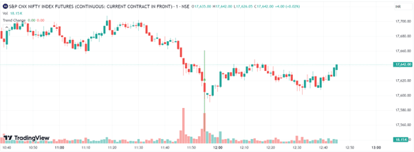
In the chart below, the price trends are visible due to the upward, downward, and sideways movement of the candlestick patterns. The chart starts with a sideways price movement, followed by a downtrend, and after a certain point, there is an uptrend with a reasonable volume, which is again followed by a sideways trend. The beginning of the downtrend is an ideal point to enter a short position or exit the market.