Table of Contents
What Are Price Action Patterns?
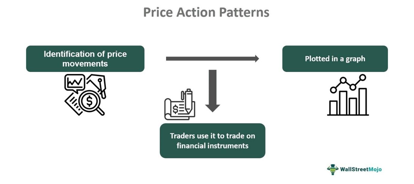
Price action patterns refer to chart patterns identified and used in technical analysis that plot the security prices over a period of time. This helps traders understand the current price levels and make trade accordingly.
This concept is applicable across stocks, commodities, and various other assets that are traded in the financial market. Price action forms the basis of technical analysis for investors to make informed decisions not only for short-term trading but also for investment as per individual financial objectives for the long term.
Key Takeaways
- Price action patterns are indicators used in technical analysis, where the prices of security traded are plotted in a graph for a particular time frame.
- The plotting may be for 15 minutes, hourly, daily, weekly, etc, as various time frames are used for trading.
- In the financial market, price action helps traders and investors identify the current prices and future trends, which facilitates trade and investment decisions.
- It uses historical data to calculate the current prices and forms the basis for technical analysis for future projections.
Price Action Patterns Explained
Price action patterns are price movements of financial instruments plotted in a chart, which forms the basis for technical analysis. Traders use it to make trade decisions, and investors decide on long-term investments based on their financial goals and risk-taking ability.
Innumerable market participants trade in various financial instruments on a day-to-day basis. This continuous buying and selling creates price volatility. Apart from buying and selling pressure, there are also other factors like social and political scenarios, the financial situation of the corporates, news, and rumors that create price fluctuations.
All the above reasons combined form price movements that are plotted in graphs that visually represent the volatility through advanced price action patterns. Investors observe and interpret these graphs using various indicators that give an idea about the current conditions and future trends.
Price action patterns are identified directly using the shape, size, and color of candlesticks and the way they are arranged in the chart. Where and when they appear is also a factor to consider while determining their meaning. Using them, traders are able to estimate the price movement, which can be either upwards, downwards, or sideways.
Top 7 Price Action Patterns
Among many advanced price action patterns that the charts depict, here are some of the top 7 ones that are widely used in the financial market. Each of them is explained with the help of charts taken from TradingView, as given below:
#1 - Bullish and Bearish Engulfing Pattern:
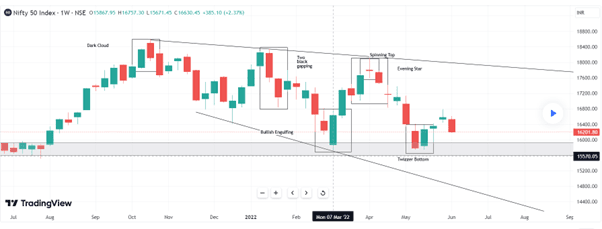
These patterns are pervasive and show whether the market may go upwards or downwards. In a bullish engulfing pattern, there is a small red candle that appears in the chart, as shown on 7th March, and a big green bullish candle engulfs it. This is a bullish signal, signaling that the market will move up, which happened in this case.
Bullish Engulfing Pattern
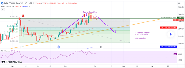
In the case of bearish engulfing, the opposite happens. There is a small green candle followed by a big red bearish candle that engulfs the red one. It is an indication of the downtrend in the future. The graph of TCS below shows this pattern.
Bearish Engulfing Pattern
#2 - Morning Star and Evening Star:
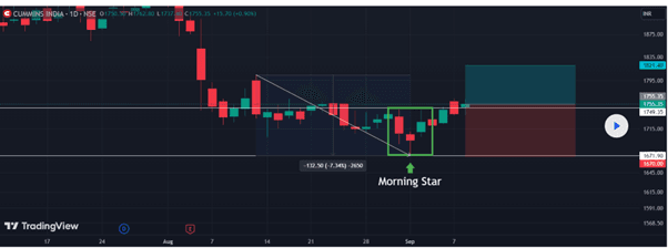
The morning star is one of the best price action patterns and is a trend reversal indicator. Here, first, a red bearish candle appears, followed by a doji, and then the third is a bullish green candle. It appears at the end of a downtrend. The first candle denotes the possibility of a down move, the second one denotes indecisiveness, and the third green candle is an indication of an uptrend. The chart below shows this pattern.
Morning Star
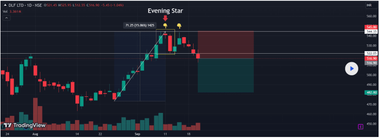
Quite contrary to the above, the evening star is also a trend reversal indicator. Still, the first is a green candle, showing the possibility of an uptrend, followed by an indecisive doji, and finally, a big red bullish candle for a downtrend. The chart below depicts the same.
Evening Star
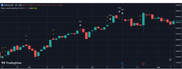
#3 - Doji Candle
Doji is one of the candlestick price action patterns that denotes indecision in the market. It has a tiny body since the opening and closing prices occur at almost the same level. It has various types like gravestone, dragonfly, and long-legged doji candles. One of them is shown in the chart below:
Doji
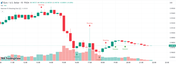
#4 - Hammers and Shooting Stars:
Another one of the best price action patterns is a hammer pattern, which is formed when the financial instrument opens at a specific price but trades significantly higher or lower than that price for quite some time. Then, the price closes near the opening price. It indicates a possible price reversal and gives the appearance of a “T.” For the hammer, the lower shadow is twice the body. For the inverted hammer, the upper shadow is twice the body. Both are bullish indicators, signifying an up move. They occur at the end of a downtrend. For a shooting star, the formation is the same as an inverted hammer, but it is a bearish pattern, signifying a down move, and occurs at the end of an uptrend. An example of the above is shown in the chart below:
Hammers and Shooting Stars
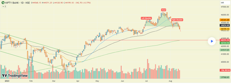
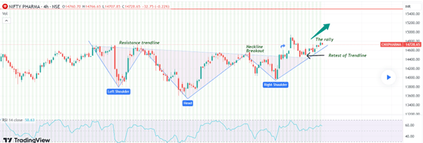
#5 - Head and Shoulder Patterns:
This is another candlestick price action pattern that is very prevalent in trading. For the head and shoulder, there are two high upper swings called shoulders, with a higher upper swing in the middle, called the head. In the case of an inverted head and shoulder, the picture is just the opposite. Both are trend reversal indicators, with the inverted head and shoulders signifying the possibility of upward movement. Both are shown in the charts below:
Head and Shoulder
Inverted Head and Shoulder
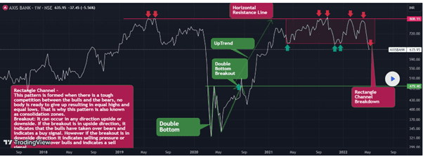
#6 - Rectangle Patterns:
Rectangle patterns are formed when price moves between two parallel lines, forming a rectangle. The upmoves can be connected by an upper trend line, and downmoves are connected by a lower trend line. They can be bullish, where the breakout will happen on the upside, and bearish, when the breakout happens on the downside. Both are shown in the charts below.
Bullish Rectangle
Bearish Rectangle
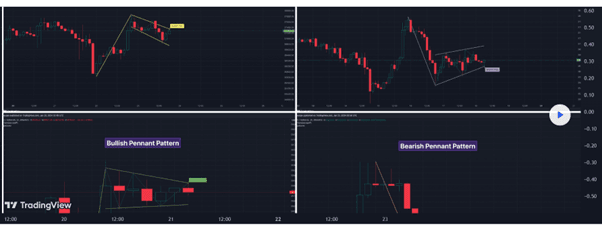
#7 - Flags and Pennants:
Flag patterns are price action patterns indicator, that depict price changes by forming a flag by joining the highs and lows within parallel trend lines. They appear like a flag with a long pole and move counter to the current price trend. This happens when the price deviates for a very short time and then resumes. This new trend typically happens with a lot of momentum. Thus, it follows the old trend, with good volume, has a breakout, and provides strong confirmation of the price direction. They can be bullish or bearish, depending on which direction the breakout is taking place.
Pennant is similar to a flagpole and has a continuation pattern. But the difference is that for the pennant, the shape is like converging trendlines. The volume plays an essential part because the initial volume is more, which keeps decreasing as the trendlines meet. During breakout, the volume increases again. Both the flag and pennant are shown below.
Flags and Pennants
Thus, the above price action patterns give a comprehensive view of the various indicators that traders commonly use in the financial market to get a clear picture of price direction and trends.
For professional-grade stock and crypto charts, we recommend TradingView – one of the most trusted platforms among traders.
Disclosure: This article contains affiliate links. If you sign up through these links, we may earn a small commission at no extra cost to you.