Table Of Contents
Chart Visuals in Power BI
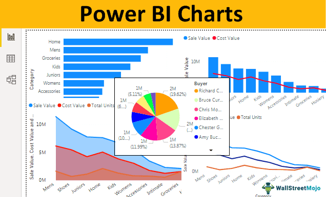
While creating the Power BI dashboard chart, visuals are the most eye-catching. Charts are better suited for any dashboard with numerical data sets but knowing about the in and out of the chart is necessary to create the right kind of chart type for the data sets. In addition, it is important to know that not all charts fit into all kinds of data sets. So, it would be best if you were choosy while building charts. In this article, we will introduce you to various types of charts in Power BI.

Top 9 Types of Charts Visualization in Power BI
When you look at the visualization gallery of Power BI, you will see plenty of visual types. However, in this article, we will concentrate only on chart visuals.
Copy and paste the data directly to Power BI. Else, you can copy it to an Excel file and then import it to Power BI as an Excel file reference. So, you can download the Excel workbook template from the link below, which is used for this example.
#1 - Clustered Bar Chart
The first chart visualization you have in Power BI is the bar chart. These horizontal bar charts show the graphical representation of the selected category data points. For example, bar charts show the number of units sold, the sale value of different categories, etc.
To create a Clustered bar chart, select the "Clustered bar chart" and drag the required data in the “Value” field, as shown below.

The below-clustered bar chart shows the category-wise number of units sold data.

#2 - Clustered Column Chart
It is the opposite of the above chart. This Power BI chart type shows the bars vertically. Whereas "Clustered bar charts" show the bars horizontally.
To show a Clustered Column chart, select the "clustered column chart" and drag the required data in the "Value" field, as shown below.

The below chart shows the quarterly "Sale Value" and "Cost Value."

#3 - Combo Chart
The combo chart is nothing but the combination of two charts, typically a combination of "Column Chart" and "Line Chart" to show different data points where we can compare one data point against the other data point.
For example, if you want to compare monthly "Sales Value" and "Cost Value," then we can use this combo chart to plot our data points.
To make a combo chart, select the "Line and stacked column chart" and drag the required data in the "Values" field, as shown below.

The below chart shows the category-wise "Sales Value" vs. "Cost Value."

This chart easily identifies which category cost is increasing even though sales are on the higher side.
#4 - Area Chart
An area chart in excel is an advanced line chart where the area between each data and different line items is filled with color, pattern, or texture. An area chart is used to show what is the gap between one data point to another data point and make some decisions in terms of whether the sale increased over some time or not.
Choose "Area chart" from visualizations to create an area chart and drag the required data in the "Values" field, as shown below.

The below chart shows the area between sales value, cost value, and the number of units sold for each category.

#5 - Line Chart
An area chart is filled with some color or texture between one data point to another data point, but the line chart comes with no fill color or texture.
The below image shows the difference between the area chart and the line chart.

#6 - Pie Chart
We all know this chart in excel, in Power BI too, it works similarly. Power BI Pie Chart shows the portion of each category against the overall value.
To create a Pie chart, select the "Pie chart" and drag the required data in the "Values" field, as shown below.

The below chart shows the buyer-wise total unit's data point in the pie chart.

Looking at this pie chart, we can see that "Bruce Curran, Chris Monroe, and Richard Carr" are the buyers who bought many units.
#7 - Doughnut Chart
A Doughnut chart is a kind of pie chart named "Doughnut" because they look like "DOUGHNUT." The pie chart shows the full portion where the inner circle is fully occupied but will not occupy the doughnut chart inner circle.
Below are two charts showing the difference between the pie chart and the doughnut chart.

However, in the doughnut chart, we can play with the inner circle radius under the format section of the chart.

#8 - Funnel Chart
This funnel chart is typically used when the data points are from largest to smallest.
Select the "Funnel" chart to create a funnel chartand drag the required data in the "Values" field, as shown below.

Below, the funnel chart shows the sales value buyer-wise.

As you can see above, we have the highest value at the top, the second-highest below that, and so on.
#9 - Gauge Chart
A Gauge Chart is one KPI chart that shows actual performance against the set targeted value. This chart requires "Target Value" to be given to gauge the actual value against it.
The below chart shows the actual value of 85 vs. the targeted value of 100.

Formatting of Power BI Charts
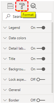
Default settings will create every chart, but we can play around with these settings under the format section of each chart. Once the chart is selected, we can see its field area on the right side next to its field area. We can see the "Format" option.

As you can see above, each chart has various formatting options. We can play with these settings and apply custom touch to the charts.
Note: We can also download the Power BI dashboard file from the link below. We can view the final output.
Things to Remember
- Apart from built-in charts, we can also download custom charts from the marketplace.
- We must identify what the best fit chart for the data set is.
- We must use the formatting section to play with the chart's settings.

