Moving Average Convergence Divergence Histogram
Table Of Contents
What Is Moving Average Convergence Divergence Histogram?
A moving average convergence divergence or MACD histogram is an element of the MACD tool charted around the baseline, a horizontal axis. It is a bar chart depicting the difference between the other two components of the MACD tool — the signal line and the MACD line.
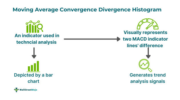
The MACD histogram gives key insights into the direction and strength of a financial instrument’s price momentum. Positive histogram bars signal rising upward momentum. On the other hand, negative bars are an indication that downward momentum is increasing. Whether or not this indicator is negative or positive is dependent on whether the MACD line is below/above the signal line.
Key Takeaways
- A moving average convergence divergence histogram is a bar chart that graphically shows the difference between the MACD line and the signal line, which are two components of the MACD indicator.
- This indicator can help gauge the strength of a trend and enables individuals to predict potential price reversals. The histogram is positive when it is above the zero line and negative when it is below the same line.
- Traders can use reversal trading and divergence trading strategies to use this indicator effectively.
Moving Average Convergence Divergence Histogram Explained
The moving average convergence divergence histogram refers to a technical indicator represented by bars that plot the distance between the MACD indicator’s signal line and the MACD line. It aims to eliminate the MACD’s tendency to lag a security’s price movements. Moreover, traders can use this tool to spot potential price swings and trend reversals. One can use this histogram to monitor longer cycles through the utilization of monthly or weekly price data.
Derived from the MACD indicator, the histogram was developed by Thomas Aspray in 1986. Individuals can compute this element of the MACD by using the following formula:
Moving Average Convergence Divergence Histogram = MACD Line – Signal Line
Where:
- MACD line refers to the difference between the 26-day exponential moving average and the 12-day EMA.
- The signal line is the MACD line’s 9-day EMA
Interpreting this histogram is easier for individuals when compared to observing the two lines of the MACD indicator. This is because, in some cases, it can be challenging to tell which of the two curves is steeper.
How To Read?
In many cases, this tool provides crucial trend analysis signals. When the histogram is higher than the zero line, it signals that the 12-day EMA is higher than the 26-day EMA, and the financial instrument is in an upward trend. On the contrary, if the MACD histogram is lower than the zero line, it is a sign that the 26-day exponential moving average is above the 12-day EMA and the security is in a downward trend.
Troughs and peaks in the histogram are an indication of whether a burst of bullish or bearish momentum is losing strength. Moreover, they can indicate whether it is likely for the curve to get back to the mean.
Let us look at the following TradingView chart to understand the technical indicator better.
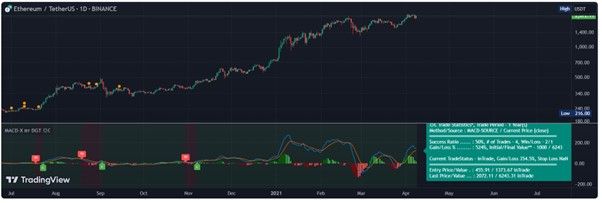
Source: TradingView
In the above chart, the blue line is the MACD line, while the yellow line is the signal line. Also, note that the MACD histogram represented by red and green bars is the vertical distance between the blue and yellow lines.
When bars are above the zero line, they are green, signifying a positive histogram, depicting bullish momentum. On the other hand, if the bars are red, it means that the histogram is below 0 or negative, representing bearish momentum.
For instance, On January 3, 2021, the MACD line is above the signal line, and the histogram bars are green, signaling bullish momentum. That said, on February 23, 2021, the histogram is red, signifying bearish momentum. Traders can use these bars to determine whether the strength of a trend is weakening or strengthening. Accordingly, they can make informed decisions.
How To Use In Trading?
Traders can use multiple strategies to trade with the help of this indicator. Some key strategies are as follows:
#1 - Trend-Following Strategy
This involves using the histogram to get confirmation regarding the trend’s strength and, accordingly, entering or exiting the trade accordingly. For instance, buying a security when the histogram is higher than 0 and selling when the histogram drops below 0.
#2 - Divergence Trading
One can use this strategy when the MACD histogram and the price do not move in the same direction. In other words, they move in completely opposite directions. The opposite movement signals a weakening trend and a potential reversal. For instance, in this case, traders would make a purchase when the security’s price records a lower low while the MACD histogram makes a higher high. Similarly, they would place a sell order if the security’s price records a higher whereas the MACD histogram records a lower high.
#3 - Reversal Trading
This method involves utilizing the moving average convergence divergence histogram to take advantage of possible trend reversals. This means placing a sell order when this histogram crosses zero from above and buying the financial instrument when the histogram drops below zero from above.
Examples
Let us look at a few moving average convergence divergence histogram examples.
Example #1
Suppose Sam is an experienced equity trader. He has Stock DFG on his watchlist. He used the MACD indicator to analyze stock price movements. The moving average convergence divergence histogram turned green as the MACD line crossed the signal line from below. He spotted this great opportunity to make the most of the impending trend reversal as the price started to climb up with the bullish momentum.
However, he did not want to rely only on this indicator. Hence, he used the relative strength index or RSI as well. When the RSI crossed 60 with the green MACD histogram, signaling increasing bullish momentum, he placed a buy order. His decision was correct as the price rose further, allowing him to earn substantial gains.
Example #2
According to a report published on July 15, 2024, after the sale of the seized Bitcoins held by the government of Germany, this cryptocurrency’s price surged again, reaching $62,500.
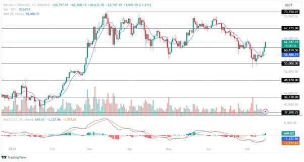
Source: TradingView
The moving average convergence divergence histogram in the above chart signals a rise in buying pressure when compared to selling pressure. Additionally, in the 1-day timeframe, the averages have formed a bullish convergence, indicating an optimistic outlook for the cryptocurrency. Per the analysis, if the buyers held prices above the crucial $61,000 support level, Bitcoin would move towards $67,775, the upper resistance level in the same month.
For professional-grade stock and crypto charts, we recommend TradingView – one of the most trusted platforms among traders.
Disclosure: This article contains affiliate links. If you sign up through these links, we may earn a small commission at no extra cost to you.