Table Of Contents
What are Maps in Power BI?
Maps represent the location of any place, which uses coordinates or latitudes and longitudes to display a place on a map. In Power BI, it is integrated with bing maps. Bing is a search engine like Google to help users create maps.
The map is a kind of vision part of Power BI visualization software. Using this visual, we can show geographic-based or location data values on respective areas of the map according to the location name. You must be wondering how this map visually identifies the location on the map.
Power BI maps are integrated with "Bing Maps" to coordinate with location names from the data. So, we can create two kinds of map visuals in Power BI. One is a "Bubble Maps," and another is a "Filled Maps." Bing recognizes the location name, address, or any geographical attribute and plots the selected data on the map.

How to Create a Maps in Power BI?
To create a visual map, you must have a data set with location names. For example, we have prepared the sales data with city names in India below.

Download the workbook to use it to Map visual.
Follow the below steps to create your first visual on maps.
Open Power BI software.
Click "Get Data" and choose the data form as "Excel."

Now, the file chooser window opens up. Choose the downloaded file from the saved location from this window.

Before you upload the data, choose the "City_Sales." Then, it will ask you to select the Data Table from the Excel file.

The table name in the workbook is "City_Sales," so we have chosen the file. We will click "Load" to upload the data to Power BI software. Under the "Data" layout, we can see the uploaded data.
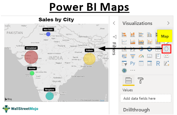
Return to the “Report” layout and click on the “Map” visual.

Before you go to the next step, let us explain the fields of the “Map” visual.
Location is nothing but geographical names. In our example, city names are the location.
Latitude is the code available to find the location map on Bing.
Longitude is the code available to find the location map on Bing.
Size is nothing but what data values we need to show as a bubble on the map. In this example, data "Sales Value" is what we need to show the bubble.
Note: Latitude and Longitude are broader concepts. Let us not touch that at this point.Selecting the inserted blank map visual, drag and drop the "City" column to the "Location" field.

You must have seen that the map automatically finds these city names.
Drop the "Sales" column to the "Size" field.

Now we have bubbles on respective areas of the map.
Once the data sets are plotted on the map, we need to play around with the formatting and other settings of the map.
The first thing you need to do is to enlarge the map to fit the page view.

By selecting the map visual, click on the "Format" option to see various formatting options.

Change each bubble color manually under "Data Colors" formatting.

If you want to see the city name on each label, you can turn on the "Category labels."

You can increase or decrease the bubble size under "Bubbles."

We can change the theme of the map under "Map styles."

Like this, we can do several other settings and formatting in a bid to make the map visual look more beautiful.
Note: We can also download the Power BI dashboard file from the link below. We can view the final output.
Things to Remember
- The map visual requires the exact location name to identify the location on the map.
- The size should always be the numerical data set to show the bubble size.
- We can increase, decrease the bubble size and change each bubble's colors to a different color.

