Table Of Contents
Examples of Line Chart in Excel
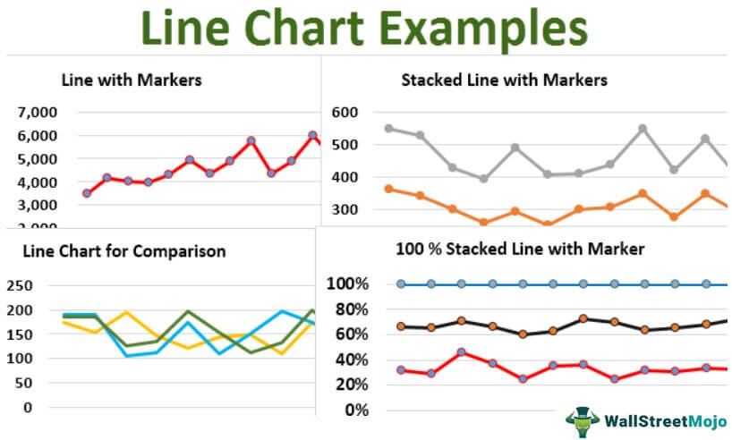
The line chart is a graphical representation of data that contains a series of data points with a line. These types of charts are used to visualize the data over time. For example, you can consider the below-given Line Chart In Excel.
Line charts can display lines horizontally that consist of the horizontal X-axis, which is an independent axis because the values in the X-axis do not depend on anything. Typically, it would be time on the X-axis as it continues to move forward irrespective of anything) and the vertical Y-axis, which is the dependent axis because the values in the Y-axis will depend on the X-axis. The result is the line that progresses horizontally.
Table of contents
Different Types of Line Charts with Examples
There are different types of line charts. They are:
- Line chart – It shows the trend over time (years, months, days) or other categories. It is used when the order of time or types is important.
- Line chart with Markers – It is similar to the line chart, but it will highlight data points with markers.
- Stacked Line chart – This is a line chart where lines of the data points do not get overlapped because they will be cumulative at each point.
- Stacked Line chart with Markers – This is similar to the stacked line chart but will highlight data points with markers.
- 100% Stacked Line chart – It shows the percentage contribution to a whole-time or category.
- 100% Stacked Line chart with Markers – This is similar to a 100% stacked line chart, but markers will highlight data points.
Line Chart in Excel - Explained in Video
Excel Line Chart Video Explanation
Let us discuss the types of different line charts with examples as below:
Example #1 - Line Chart
Assume that we got the sales data quarterly from Q1-16 to Q3-19. Now, we use a line chart to see the trend in the sales for the given period. So, let us plot the line chart for the given data as follows:
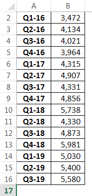
First, we should select the data that needs to be plotted and then go to the “Insert tab” as follows:
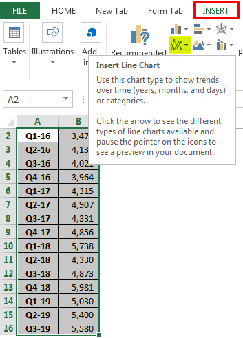
As seen in the above picture, we got an option of line charts that need to be selected.
Then we will get the list of line charts available, and we should select the line which will be the first one on the list as we are plotting a simple line graph for the data.
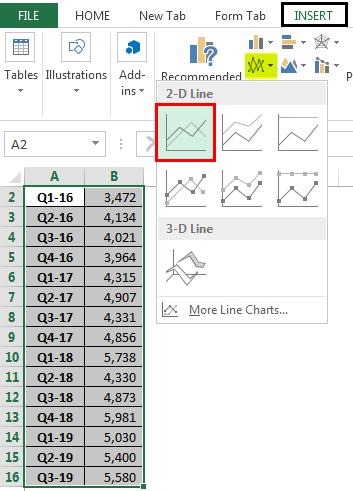
As soon as we select the first type of line graph, which is squared with red color in the above image, we will get the graph plotted as below:
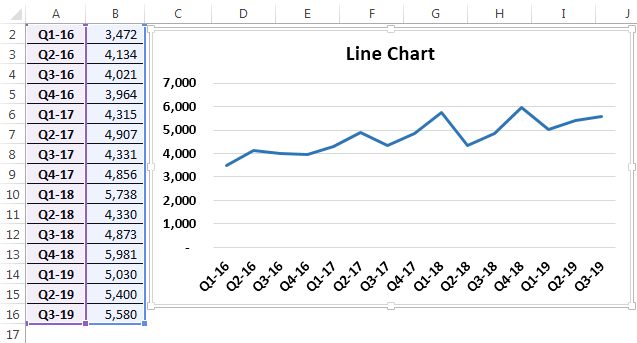
The above graph shows the trend in sales for the given period. We can observe that there are fluctuations in sales during certain quarters, which will help management figure out the reason for the fall or rise of their sales numbers during that period.
Example #2 - Line Chart with Markers
As we had seen the line graph in the above example, we could not see the mark of the exact place of data points. Therefore, to get the markers for the line, we should select from the type of line chart, i.e., line with markers, as shown below:
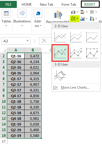
Select the graph type with markers marked with a red-colored line in the above diagram. You will get the line chart with markers plotted for the given data points as follows:
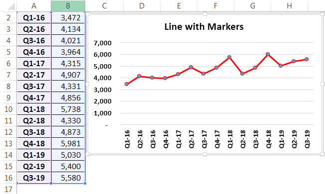
Now, we can see the markers for the data points. It will give better visualization to note the data points, and we also can use “Data Labels” from the options of a line chart to showcase the data points on the graph.
Example #3 - Stacked Line Chart
Let us assume that we got the sales data of different segments in the company's residential market, as shown below. We can use a stacked line chart to show the cumulative sales in a particular month. Let us see how to plot the stacked graph.

Select the data that needs to be plotted and go to the "Insert" tab and select the "Line Chart," and click on “Stacked Line Chart,” which is marked in a red-colored as shown below:
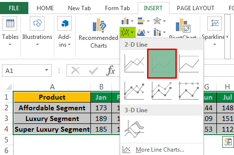
Now, we can see the data in stacked form plotted in the graph below:
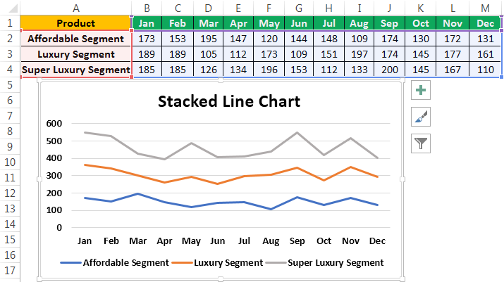
We can observe the lines are not getting overlapped because the stacked graph gives us the cumulative at each point. So in our example for Jan, the affordable segment point on the line shows the sales data of that particular segment. Still, the luxury segment point shows the cumulative of both affordable & luxury segments. Similarly, the super-luxury segment combines affordable, luxury, and super-luxury segments.
Example #4 - Stacked Line Chart with Marker
To get the mark on the data points for the stacked line graph, we can use the stacked line with marker chart type as below:
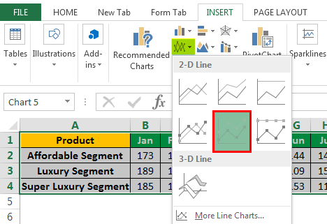
And our chart will look like the one below with the markers:
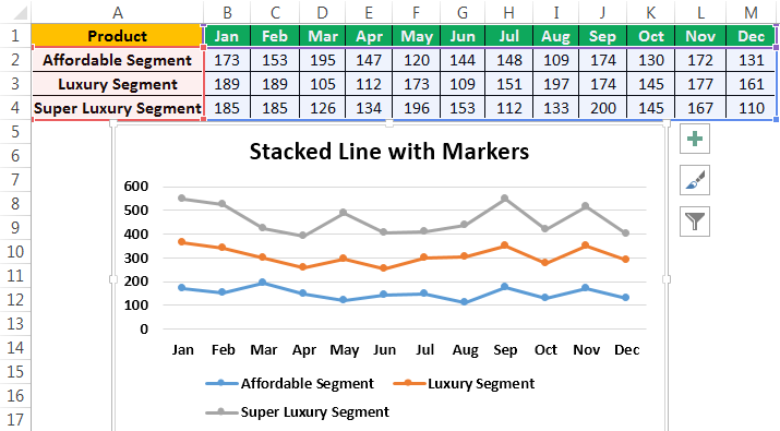
This type of chart is used to visualize the data points on the graph better. We can also use data labels to show the data values on the markers.
Example #5 - 100% Stacked Line Chart
The 100% stacked line chart is similar to the stacked line chart, but the key difference is that the cumulative is based on the values of certain categories. But in the 100% stacked line chart, the cumulative shows in terms of percentage. Let us see how to plot the 100% stacked line chart and also how it looks:
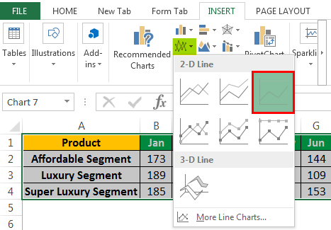
Select the data that needs to be plotted and go to the “Insert tab,” select the "Line Chart," and click on “100% Stacked Line Chart,” which is marked in red color as shown above:
And our chart will look like –
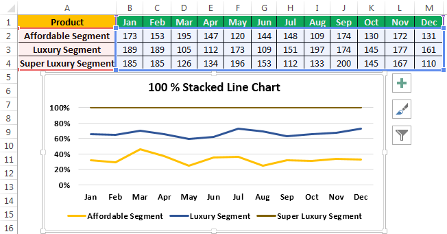
From the above graph, we can observe that the data points are cumulative percentages. For Jan, the affordable segment contributed 30% of total segment sales. Both affordable & luxury segments contributed 68% of the total segment sales, and affordable, luxury & super luxury segments together show 100%, which is the entire sales in Jan.
Example #6 - 100% Stacked Line Chart with Marker
To get the mark on the data points for the 100% stacked line graph, we can use the 100% stacked line with marker chart type as below:
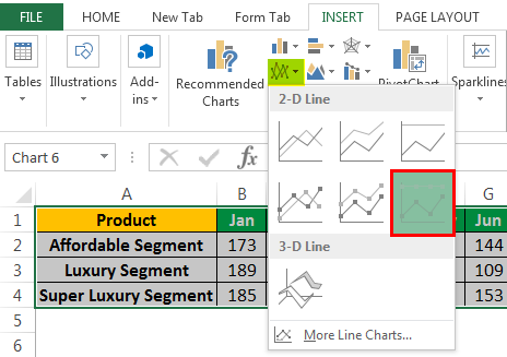
And our chart will look like the one below with the markers:
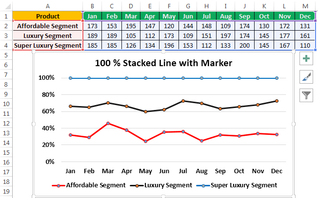
This type of chart is used to visualize the data points on the graph better. We can also use data labels to show the data values on the markers.
Example #7 - Using a Line Chart for Comparison
Let us take the data of the residential housing segment discussed in previous examples and plot the line graph for the entire data as below:
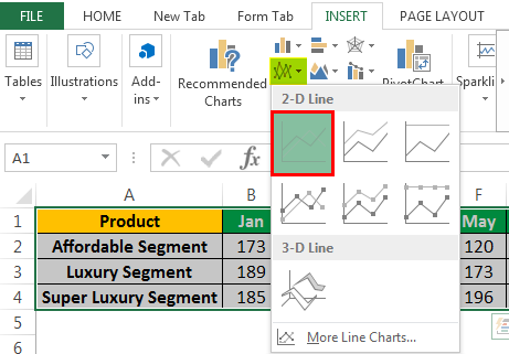
And it will plot the line graph with all the data points below, which we can use for decision-making purposes.
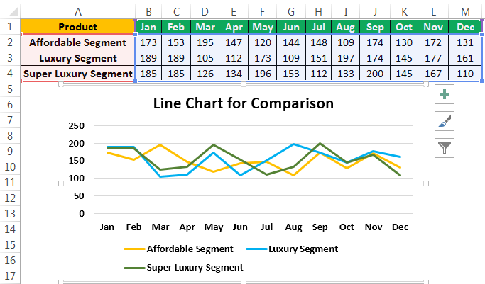
The above chart shows the different lines for different segments of the houses. We can observe how each segment's sales fluctuate and intersect the line in any month. We can plot it with a marker and data labels for better understanding and visualization.
Things to Remember About Line Chart Examples
- Line charts will help us show how different categories stand to each other and can be used cumulatively if the sum of all categories is important for decision-making by plotting the stacked or 100% stacked line charts.
- Line charts will perform exceptionally for many data with different time intervals.
- Line graphs play a key role in the comparison of different categories. It shows the trend of the data very clearly. Also, using markers and labeling the data will help for better visualization.
You can download this Line Chart Examples Excel template here – Line Chart Examples Excel Template
Recommended Articles
This article is a guide to Line Chart Examples in Excel. We discuss the top 7 line chart types, practical examples, and a downloadable Excel template. You may also learn more about Excel from the following articles: -
