Table Of Contents
Creating Excel Interactive Chart
Charts' visuals are better to tell the story. Everyone knows it, but interactivity is required with the chart to tell the story better. Interactivity is when the user can see certain values in the Excel chart. They should be able to see that result when they click the button. For example, if the chart shows "Sales & Cost" values. If the user wants to see the "Profit" chart, then if they click on the "Profit" option, they should see the chart accordingly.

Examples to Create Interactive Chart in Excel
Example #1
We have monthly sales values, as shown below.

Instead of seeing all the month's values in the column chart in excel we want to see single month values. So, if we click on the "Forward" button, we should keep looking at the next month's values in the chart.
Follow the below steps to create an interactive chart.
We must first copy the above data table and paste-like the below image.

Below that, create a similar template but without values.

Under the Excel Developer tab, click on Insert and choose Scroll Bar.

Draw this button on the worksheet, as shown below.

Then, right-click on the scroll bar in Excel and choose Format Control.

Now, the Format Control window comes up. In this window, choose the Control tab.

Make the current value zero, the minimum value is zero, and the maximum value is 12 because we have only 12 months of sales value.
Next, we must make the incremental change as 1 because whenever we click on the forward button, it should change by 1. Then, make Page Change as zero, and give a cell link as A6. Finally, click on OK to close out that window.

Now, click on the Forward button of the scroll bar and see the value in the A9 cell.

We have clicked on the Forward Button of the scroll bar three times. Therefore, in cell A9, we have a value of 3.Similarly, if we click on the Backward Button, it will reduce by 1 every time.

Now, in the B5 cell, we must apply the IF condition, as shown below.

Let us explain the formula to you.
The formula explains that if the A6 value (which is increased or decreased by scroll bar moment) is less than or equal to 1, then we need the value from the B2 cell (Jan Sales value), or else we need #N/A error value.
Similarly, change the formula for Feb month, as shown below.
Since Feb is the second month, we need the value from the Feb month cell (C2 cell) only when the scroll bar cell value is e=2. The scroll bar cell value (A6 cell) is 1, so the formula has returned the #N/A error value.Like this, we must change the numbers for each month.

Because the scroll bar value is 12, we have all the months' sales value.Insert the Clustered Column chart in Excel for this newly created table.

It will create a chart like this.
Do some font change and color formatting for fonts and column bars.
Hide the rows of the actual table (first two rows).Now, click on the Backward Button scroll bar and see the magic.

Because the scroll bar linked, the cell value is 5, our chart is also showing only five months' values, and the other month's values are just empty.
Example #2
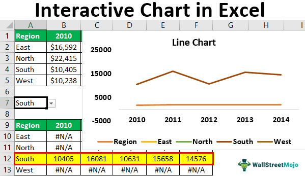
Now, we will see one more interactive chart. Below is the region-wise sales data.

First, Create a drop-down list in excel of “Regions.”

Below this, it creates a table replica from the above table but deletes numbers.

Now, we must apply the formula as shown below.

Like this, change the numbers for each region.

The formula says if the drop-down cell value is equal to the respective region in this table, then we need that region values from the above table.
Create a line chart and format it as we need for this chart.

We get the following line chart.

This chart will now show the region's values as per the selection made from the drop-down list.

We have selected the "West" region from the drop-down list, and the chart shows only that region's values across the years.
Things to Remember here
- Excel interactive charts require advanced Excel skills.
- Interactive charts demand data restructuring.
- We must use form controls to make the chart interactive.
- We must use the pivot charts and slicers to create an easy interactive graph in excel.

