Table Of Contents
Excel Icon Sets
Icon sets in Excel are part of conditional formatting graphics available for numerical data sets. By adding these icon graphics, we can design the numbers more beautifully.
Types of Icon Sets in Excel
There are four types of icon sets available under this category.
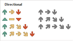
Type#1 - Directional
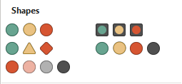
Type#2 - Shapes
Type#3 - Indicators

Type#4 - Ratings

We can use all four types of icon sets based on the data structure. We should choose based on the data we are showing to the user.
How to Use Icon Sets in Excel? (with Examples)
Example #1 - Directional Icon Set
This type of icon set is best suited to represent scores or ratings of employees and students. For example, look at the below data of employees' rating for the appraisal cycle, out of 10.
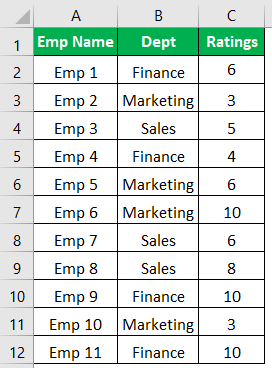
Let us apply some conditional formatting to these rating numbers. First, we will use the "directional" icon set.
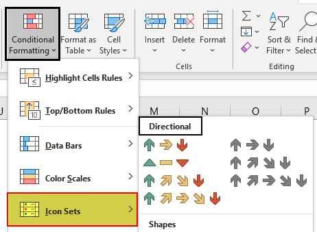
Before we apply the "directional" icon set, we can see four different kinds of icon sets in this category.
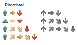
Let us use the first two sets now. But, first, we need to define the limit of rating points.
For showing the "green" colored up arrow, the rating should be >=9.
For showing the horizontal "yellow" colored arrow, the rating should be >=5.
For showing the "red" colored down arrow, the rating should be <=4.
The steps to use icon sets in Excel are as follows:
- First, select column C and click on "Conditional Formatting."
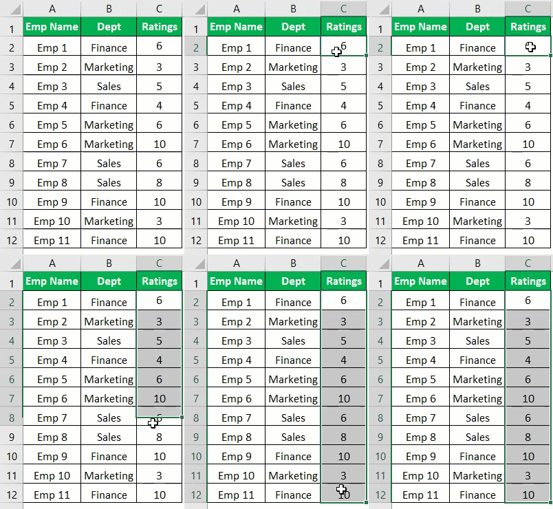
- Under "Conditional Formatting" >> "Icon Sets" >> "Directional."
- Now, we must choose the first type. We have the data below.
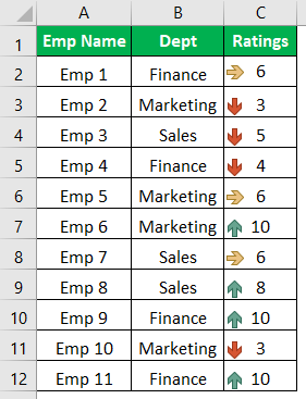
- It automatically inserts icons, selects the range of cells, and clicks on "Manage Rules" under "Conditional Formatting."
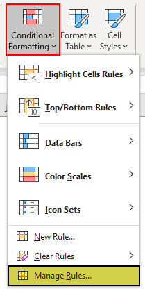
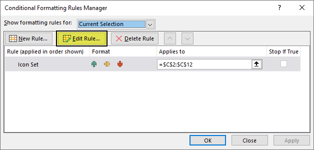
- In the below window, double click on the "Edit Rule."
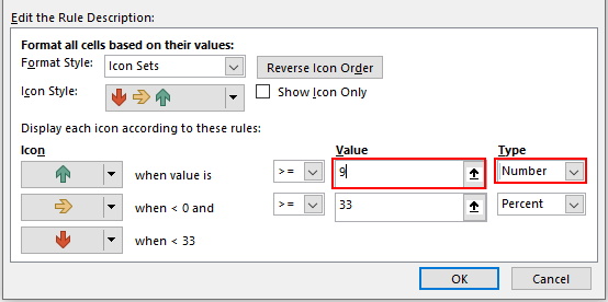
- Now, we can see the "Edit the Rule Descriptions" window.

- As we can see above, the first rule, "green arrow," is shown when the value is >=67, and the "Type" indicates the percentage. It should be a "Number," and the "Value" should be 9.
- For "yellow arrow," we must change the "Value" to 5 and "Type" to "Number."
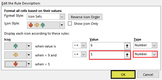
- The third rule for "red arrow" is the remaining values will be applied with the red arrow. Click on "OK" to see the directional icon set in the data.

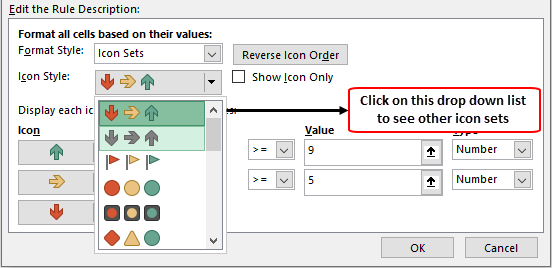
- Now, if we want to apply other Excel icon sets under directional in the "Edit The Description Rule" window, we can change the icon set option, and accordingly, we need to define the rule.
Example #2 - Shapes
The shape icon works the same as the previous one. But, we will see different data and use more than three types of shapes in this example.
Look at the below data for this example.
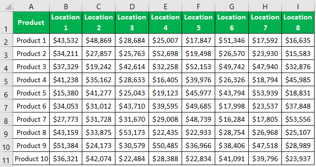
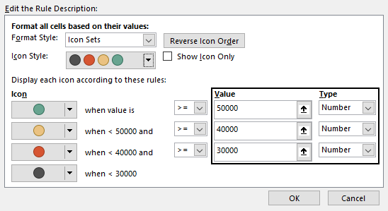
We will apply the four traffic lights for this data set. Below is the rule we use.
Green traffic light: If the number is >=50000.
Yellow traffic light: If the number is >=40000.
Red traffic light: If the number is >=30000.
Black traffic light: If the number is <30000.
Select the data, apply the traffic light first, and then edit the rule, as shown below.
We will have a traffic light like the below image for our data.
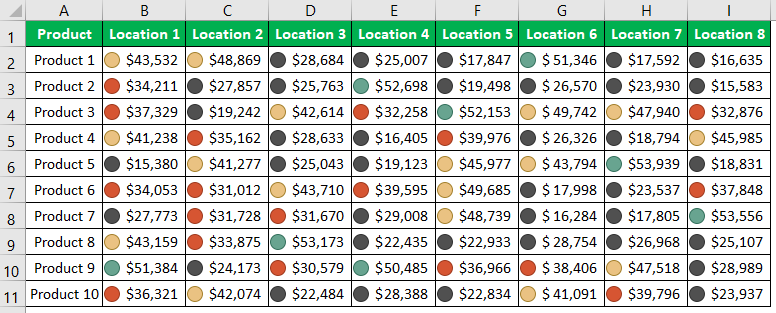
We can easily identify the good revenue-generated locations for respective products by looking at green-colored areas.
In the edit rule, we can play around with other icon sets as well. We can choose any different icon set from the drop-down list and change the rule.

We have changed from shapes to the "5 Rating" icon set and changed the rule accordingly. Click on "OK" to see the new icon set for the same data.
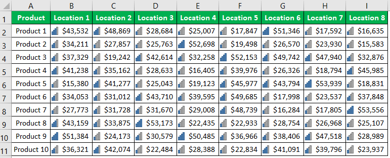
Now, we will change the icon set to "Henry Balls."
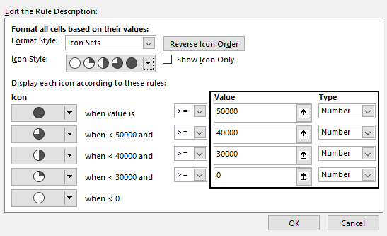
Now, the data looks like this.
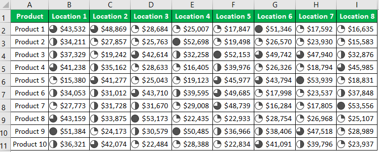
Like this, by defining rules, we can insert any icon sets.
Things to Remember
- In more than three rules, we must use five icons set category.
- Generally, "Henry balls" are used to represent percentage data.
- The traffic lights are eye-catching icon sets.
- The directional icon sets show growth or decline between two periods.
