Table Of Contents
What Is Histogram?
A Histogram is the graphical or visual representation of the distribution of categorical numeric data in a dataset. We can create them using the Analysis ToolPak or the Pivot Table, and by using the formulas. We can create the Histogram Formula using the FREQUENCY and COUNTIFS formulas.
For example, we can represent the student data, such as scores, height, weight, etc., graphically, as shown below.

Key Takeaways
- The Histogram Formula helps us to understand large datasets in a pictorial way when plotted in a graph.
- We can plot a Histogram formula’s Histogram graph in 3 different types, namely, Uniform, Symmetrical, and Bimodal Histogram.
- To plot a graph, we need a minimum of 2 variables for the X and Y Axes. So, we must take the large data, categorize it in different bins or buckets to reduce the size of the data to get it in the form of frequencies or periods,
- calculate using the formula, and then plot the graph.
Video Explanations of Histogram
Explanation of the formula of the Histogram
We can derive the formula for the calculation of the Area of the Histogram by using the following seven steps:
Firstly, it is to be decided on how we measure the process and what we should collect as data. Once determined, the data is gathered and presented in a tabular form, such as a spreadsheet.
Now, count the number of data points gathered.
Next, determine the range of the sample, which is the difference between the maximum and minimum values in the data sample.
Range = Maximum value – Minimum value
Next, determine the number of class intervals that can be based on either of the following two methods,
- As a thumb rule, use 10 as the number of intervals, or
- The number of intervals can be calculated by the square root of the number of data points, which is then rounded to the nearest whole number.
Number of intervals =
Now, determine the width of the interval class by dividing the range of the data sample by the number of intervals.
Class width = Range / Number of intervals
Next, develop a table or spreadsheet with frequencies for each interval. Then, derive the frequency density for each interval by dividing the frequency by the corresponding class width.
Finally, the Area for the Histogram equation is calculated by adding the product of all the frequency density and their corresponding class width.
How To Read the Histogram example and its interpretation?
Now that we understand the basics and different types of this concept, it is vital to understand how to read and interpret the data after it is converted into a Histogram. Let us do so through the step-by-step guide mentioned below.
- The first step is to recognize the dependent and independent variables within the set. For instance, if we are collecting data relating to the height of students in ABC school, the independent variable would be the height, and the dependent variable would be the frequency or the number of students.
- Once the data is collected, they have to segregate into different groups based on their frequency in different ‘bins’. For example, there might be 4 students with a height of 5’7” and 5 with 6’1”. In simpler words, students of the same height will be grouped for differentiation.
- After the collection of data, the different intervals can be plotted against different heights on the graph. Once the data is plotted, one can analyze the data and find similarities and differences or find the mean height of the whole data set.
Examples
Let us understand the concept of Histogram Formula Excel with the help of the following examples.
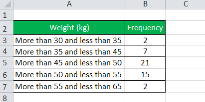
Let us consider the table below, which shows children’s weights in a class.

From the above table, we can calculate the following:
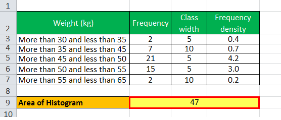
- Class width of the first interval = 35 – 30 = 5
- Class width of the second interval = 45 – 35 = 10
- Class width of the third interval = 50 – 45 = 5
- Class width of the fourth interval = 55 – 50 = 5
- Class width of the fifth interval = 65 – 55 = 10
Again,
- Frequency density of the first interval = 2 / 5 = 0.4
- Frequency density of the second interval = 7 / 10 = 0.7
- Frequency density of the third interval = 21 / 5 = 4.2
- Frequency density of the fourth interval = 15 / 5 = 3.0
- Frequency density of the fifth interval = 2 / 10 = 0.2
For the Histogram Formula calculation, we will first need to calculate class width and frequency density, as shown above.
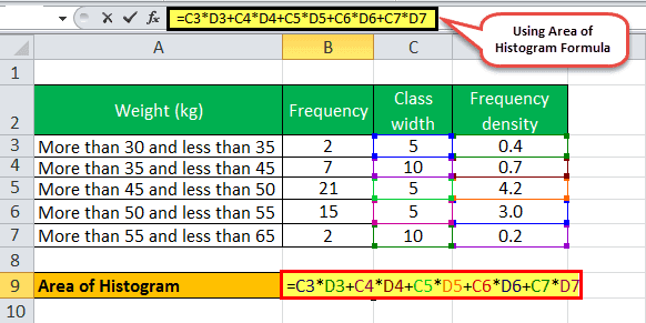
Hence, Area of the Histogram = 0.4 * 5 + 0.7 * 10 + 4.2 * 5 + 3.0 * 5 + 0.2 * 10

So, the Area of the Histogram will be –

- Therefore, the Area of the Histogram = 47 children.
A graphical representation of the weight of children is shown below:

Relevance And Uses Of Histogram
Let us understand the relevance and uses of a frequency density Histogram Formula and other related factors through the discussion below.
- The concept of a Histogram equation is very useful as it portrays a set of data. Although a Histogram looks quite similar to a bar chart, the end-use of a Histogram is very different from that of a bar chart.
- A Histogram is useful in displaying a large amount of data in a more understandable way, which is easy to visualize.
- It also captures the frequency density of each class interval. We can determine the median and the distribution of data from a Histogram. Also, the skewness of the distribution can be selected as if the bars on the left or the right are higher. Then, it indicates that the data is skewed, or otherwise, the data is symmetrical.
- A Histogram primarily finds its application in the case of large-scale exercises like a nationwide census, which may be conducted every ten years. In such cases, the data is compiled and presented in a Histogram so that we can easily study it. Also, in the cases of surveys where a Histogram is created, anyone who can interpret the Histogram can use the data later for further studies or analysis.
Important Things To Note
- When we display a Histogram formula graphically, we must make sure that there are no gaps between the displayed Bars. We can use the Format Data Series for the same.
- Ensure to sort the data in an increasing or decreasing order to plot the graph in an evenly way for better understanding.

