Table Of Contents
Histogram Graph Examples
Histogram refers to the visual presentation used for summarizing discrete or continuous data, and the example of which includes the visual presentation on the graph. The customer's complaints made in the bank on the different parameters where the most reported reason of the complaint will have the highest height in the graph presented.
One uses bars of various heights to display the data in a graphical form called the histogram graph. Every bar is grouped into ranges in a histogram. The bars that are taller in size show that most of the data will fall in that taller range. A histogram depicts the spread and shape of the continuous data set or sample data. This article will provide you with the top 4 examples of histogram graphs.

Key Takeaways
- A histogram is a visual presentation used to summarize discrete or continuous data.
- One uses bars of various heights to show the data in a graphical form called the histogram graph. It helps analyze the dataset's median and distribution, which may display gaps or outliers in the data set.
- Each bar is assembled into ranges in a histogram. The taller bars indicate that significant data falls in that more elevated range. Moreover, it shows the continuous data set or sample data spread and shape.
- It displays the given data set or distribution. In addition, it represents the data values frequently and a large amount of data.
Video Explanations of Histogram
Top 4 Examples of Histogram Graphs
Below are the top 4 examples of histogram graphs.
Histogram Example #1
SBI Manager Mr. Shaw worries about the customer complaint regarding long queues in the branch. He wants to analyze the frequency of a major customer’s waiting time. So, he called the cashier and asked him for the details.
Below is the waiting time of the customer at the cash counter of the SBI bank branch during peak hours, which the cashier observed. You are required to create a histogram based on the below data.

Solution:
We have created a histogram using five bins with 5 different frequencies, as seen in the chart below. The Y-axis is the average number of customers falling in that particular category. On the X-axis, we have a range of waiting times. For example, the 1st bin range is 2.30 mins to 2.86 mins. We can note that the count is 3 for that category from the table, as seen in the below graph.

It is a random distribution, which is a type of distribution that has several peaks, and it lacks an apparent pattern.
There can be a scenario where it combines various data properties. Hence, one should analyze the data separately.
Histogram Example #2
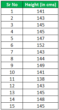
Mr. Larry, a famous doctor, is researching the height of the students studying in the 8th standard. He has gathered 15 students but wants to know which maximum category is where they belong.

Solution:
We have created a histogram using 6 bins with 6 different frequencies, as seen in the chart below. The Y-axis is the average number of students falling in a particular category. In addition, on the X-axis, we have a range of heights. For example, the 1st bin range is 138 cms to 140 cms. We can note that the count is 1 for that category from the table, as seen in the below graph.

Here, we can see the students' average heights range from 142 cm to 146 cm for the 8th standard. And also, one can note that one side of the average also falls on the other side of the average, which is a sign of normal distribution.
Histogram Example #3
Mr. A wants to invest in the stock market. Therefore, he has shortlisted the below stocks and wants to know the frequency of the prices.

Use the histogram and state what kind of distribution this is.
Solution:
We have created a histogram using 5 bins with 5 different frequencies, as seen in the chart below. The Y-axis shows the number of stocks falling in that particular category. In X-axis, we have a range of stock prices. For example, the 1st bin range is 100 to 300. We can note that the count is 7 for that category from the table, as seen in the below graph.

Here, we can note that the graph is biased towards the left side, and hence this is a sign of distribution, which is right-skewed distribution. A large number of data values occur on the left side and fewer data on the right side.
Histogram Example #4
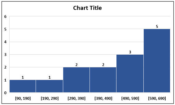
Shastri, the coach of an Indian cricket team, is analyzing batters’ average scores and wants to finalize the chosen batters for the upcoming world cup. However, he first wants to create a benchmark to shortlist the batters. He has received a list of below batters in their last 15 innings; however, he wants to know the odd one from this list. Use the histogram to find out and comment on the distribution.

Solution:
We have created a histogram using 6 bins with 6 different frequencies, as seen in the chart below. The Y-axis shows the number of batters falling in that particular category. In addition, on the X-axis, we have a range of runs. For example, the 1st bin range is 90 to 190. We can note that the count is 1 for that category from the table, as seen in the below graph.

We can see that the above table shows a left-skewed distribution. That is because many data values occur on the right side and a smaller number of data on the left side.
90 runs in 15 innings appear to be the odd one out and appear to be of a bowler and hence need to be removed.
Conclusion
Creating a histogram will visually represent the given data set or the data distribution. Histograms display the frequency of the data values and a large amount of data. Therefore, the histogram helps determine the dataset's median and distribution. Also, this can display any gaps or outliers in the data set.
