Table Of Contents
What Is A Frequency Polygon?
A frequency polygon in statistics is a graph that displays the distribution of a set of continuous data. It aims to visually represent a group of consistent data issuance, making it easier to interpret and analyse by plotting the frequency of each interval on the vertical axis and the midpoint of each interval on the horizontal axis.

It thus shows the overall pattern of the data distribution, highlighting any trends or patterns that may exist. It can be used in various fields, including statistics, economics, biology, and social sciences, to analyze and interpret data sets. They are handy for identifying outliers, detecting patterns and trends, and comparing data sets.
Key Takeaways
- Frequency polygons are line graphs representing a continuous dataset's frequency distribution. We can get it by dividing the data into intervals or bins. This calculates the frequency for each interval and plots the midpoint of each interval.
- It can help locate patterns and trends in large datasets, detect outliers, and allow easy comparisons between datasets.
- They are handy for displaying data sets with many observations or values. They are helpful in various fields, including statistics, economics, biology, and social sciences.
Frequency Polygon in Statistics Explained
The frequency polygon represents the frequency distribution of continuous data graphically. It was first introduced by English statistician Karl Pearson in the late 19th century. He proposed it based on the work of other early statisticians such as Francis Galton and Adolphe Quetelet.
Its relevance lies in its ability to visually represent data, allowing for more straightforward interpretation and analysis. As a result, they are a valuable tool in statistics, helping researchers to identify patterns and trends in large data sets.
One of the main advantages of it is that they are handy for displaying data sets with many observations or values. By dividing the data into equal intervals and plotting the frequency of each container, the polygon provides a clear and concise representation of the data distribution.
These are also helpful in identifying outliers or anomalies in the data set, as these are in the form of points that fall outside the normal range of the distribution. Again, this makes detecting and investigating unusual or unexpected data points easier.
How To Draw Frequency Polygon Graph?
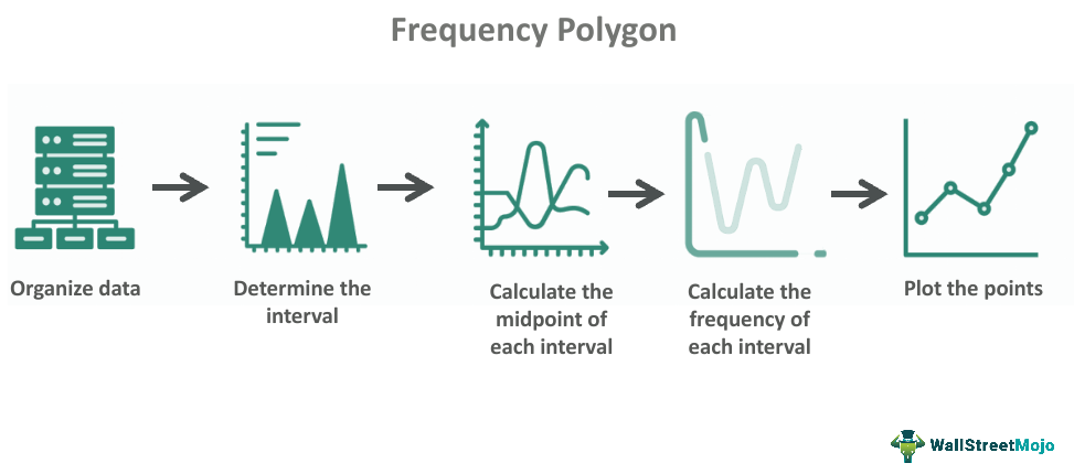
Drawing a frequency polygon graph involves several steps:

- Organize data: Start by organizing your data into a frequency table showing the observations or values in each interval or bin.
- Determine the interval: Decide the break or bin size used to group the data. This should be within the range of values in the data set and the number of observations. A general rule is to have around 10-20 intervals, each equal.
- Calculate the midpoint of each interval: Once you have determined the interval size, calculate the midpoint by taking the average of the upper and lower boundaries of the gap.
- Calculate the frequency for each interval: Using the frequency table, calculate the frequency or number of observations for each interval.
- Plot the points: Plot the midpoint of each interval on the horizontal axis and the frequency for each interval on the vertical axis. Then, connect the ends with a straight line to form the polygon.
Examples
Let us understand the topic better with the help of some examples:
Example #1
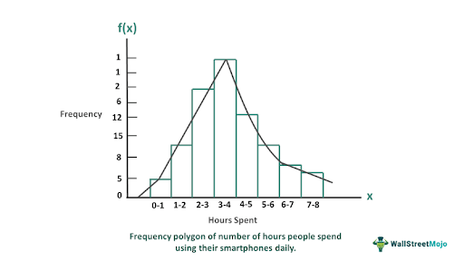
Suppose Harry is surveying the number of hours people spend using their smartphones daily. He collects data from a sample of 50 people and organizes it into the following frequency table:
| Interval (hours) | Frequency |
|---|---|
| 0-1 | 5 |
| 1-2 | 8 |
| 2-3 | 15 |
| 3-4 | 12 |
| 4-5 | 6 |
| 5-6 | 2 |
| 6-7 | 1 |
| 7-8 | 1 |

To visualize this data, he could create a frequency polygon by plotting the midpoint of each interval on the horizontal axis and the frequency for each interval on the vertical axis.
Example #2
A recent example of a frequency polygon in the news was the visualization of the COVID-19 vaccination rates in different countries. In addition, many news organizations and public health agencies have used polygons to show the distribution of vaccination rates across other age groups, regions, and ethnic groups. The US Centers for Disease Control and Prevention used polygons to show the distribution of vaccination rates by age group, with a clear peak in the age group of 65 and older.
Advantages And Disadvantages
Some of the advantages of frequency polygon are:
- Easy to interpret: These provide a clear visual representation of the data distribution, making it easy to interpret and analyze.
- Highlights patterns and trends: It can help patterns in large datasets that may be difficult to identify by simply looking at the raw data.
- Displays large datasets: These are particularly useful for displaying large datasets, as they group the data into intervals or bins, making it easier to see the overall pattern.
- Detects outliers: It can help detect outliers or unusual data points affecting the overall data distribution.
- Allows for comparison: These compare different datasets, allowing for insights and comparisons between other groups or populations.
Some of the disadvantages of frequency polygon are:
- May oversimplify the data: These group data into intervals or bins, which may oversimplify the data and hide essential details or nuances.
- Can be misleading: If the intervals or bins are not chosen carefully, it can be deceptive and lead to correct conclusions.
- May not be suitable for small datasets: These are best for larger datasets, as they may need to provide more detail for smaller datasets.
- Subjective binning: Choosing the size and number of intervals or bins is personal and can affect the resulting polygon, potentially leading to biased or inaccurate interpretations.
- Limited to continuous data: These usually represent constant data, making them unsuitable for datasets with discrete data points or categories.
Difference Between Histogram And Frequency Polygon
Some differences between histograms and frequency polygons:
- Data representation: Histograms represent data using bars, while the latter represent data using lines.
- Type of data: Histograms usually display continuous data, while frequency polygons can be used for continuous and discrete data.
- The shape of distribution: Histograms are best for displaying the form of the data distribution. At the same time, frequency polygons show the trends and patterns in the data.
- Bin size: In histograms, the width of the bars represents the bin size, while in frequency polygons, the bin size is not represented visually.
- Range of data: Histograms typically show the full range of the data, while frequency polygons may only show a portion of the data range depending on the chosen bin size and intervals.
Difference Between Frequency Polygon And Frequency Curve
Points comparing frequency polygons and frequency curves:
- Data representation: Frequency polygons represent data using straight line segments, while frequency curves represent data using a smooth curve.
- Type of data: Frequency polygons are typically used for displaying continuous data, while frequency curves can be used for serial and discrete data.
- Bin size: Frequency polygons require intervals or bins to be defined, while frequency curves do not require intervals or bins.
- Continuity of data: Frequency curves provide a continuous representation of the data, while frequency polygons may not clearly show the data's continuity.
- Smoothing: Frequency curves can be smoothed to reduce the impact of outliers, while frequency polygons cannot be filed.
Frequency Polygon vs Line Graph vs OGIVE Graph
Some differences between frequency polygons, line graphs, and ogive graphs are as follows:
- Data representation: Frequency polygons represent data using straight line segments, and line graphs represent data using a continuous line. In contrast, ogive graphs represent data using consecutive connected lines.
- Type of data: Frequency polygons and ogive graphs are typically used for displaying continuous data, while line graphs can be used for serial and discrete data.
- Y-axis: Frequency polygons and ogive graphs typically use the frequency or cumulative frequency on the y-axis, while line graphs may use a range of variables on the y-axis.
- X-axis: All three graphs use a continuous variable on the x-axis, typically with intervals or bins defined for frequency polygons and ogive graphs.
- Smoothing: Line graphs can be ground to reduce the impact of noise or outliers in the data, while frequency polygons and ogive graphs cannot be filed.
