Table Of Contents
Chart Wizard in Excel
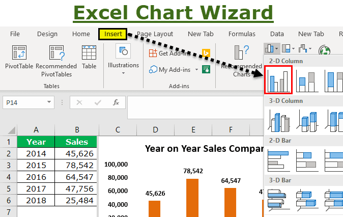
Chart Wizard in Excel is a wizard that takes users or guides them through a step-by-step process to insert a chart in an Excel spreadsheet. It was available in Excel in older versions under "Chart Wizard." In addition, we have the "Recommended Charts" option for the newer versions, where Excel itself recommends various types of charts to choose from.

How to Build a Chart using the Excel Chart Wizard?
Let us consider the below data as our chart data. Based on this data, we are going to build a chart.
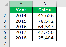
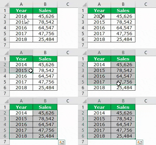
- Step 1: Firstly, we need to select the data first. In this case, the data range is A1 to B6.
- Step 2: We need to go to the "Insert" tab. Then, under the INSERT tab, go to the "Charts" area.

- Step 3: Since we have selected a column chart, click on the "Column Charts."
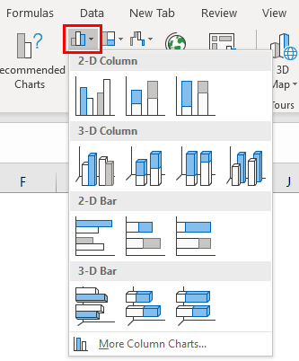
- Step 4: Select the first chart in this.
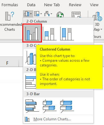
- Step 5: As soon as we click on this chart, Excel shows the default chart like the one below.
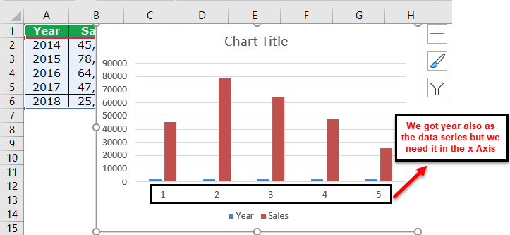
- Step 6: This is not a fully equipped chart. We need to make adjustments to this chart to look better and more beautiful.
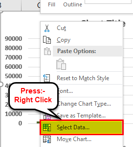
Firstly, right-click on the chart and select "Select Data."
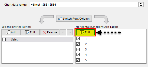
- Step 7: In the below window, we need only the "Sales" column to be shown as column bars, so we must remove "Year" from this list.
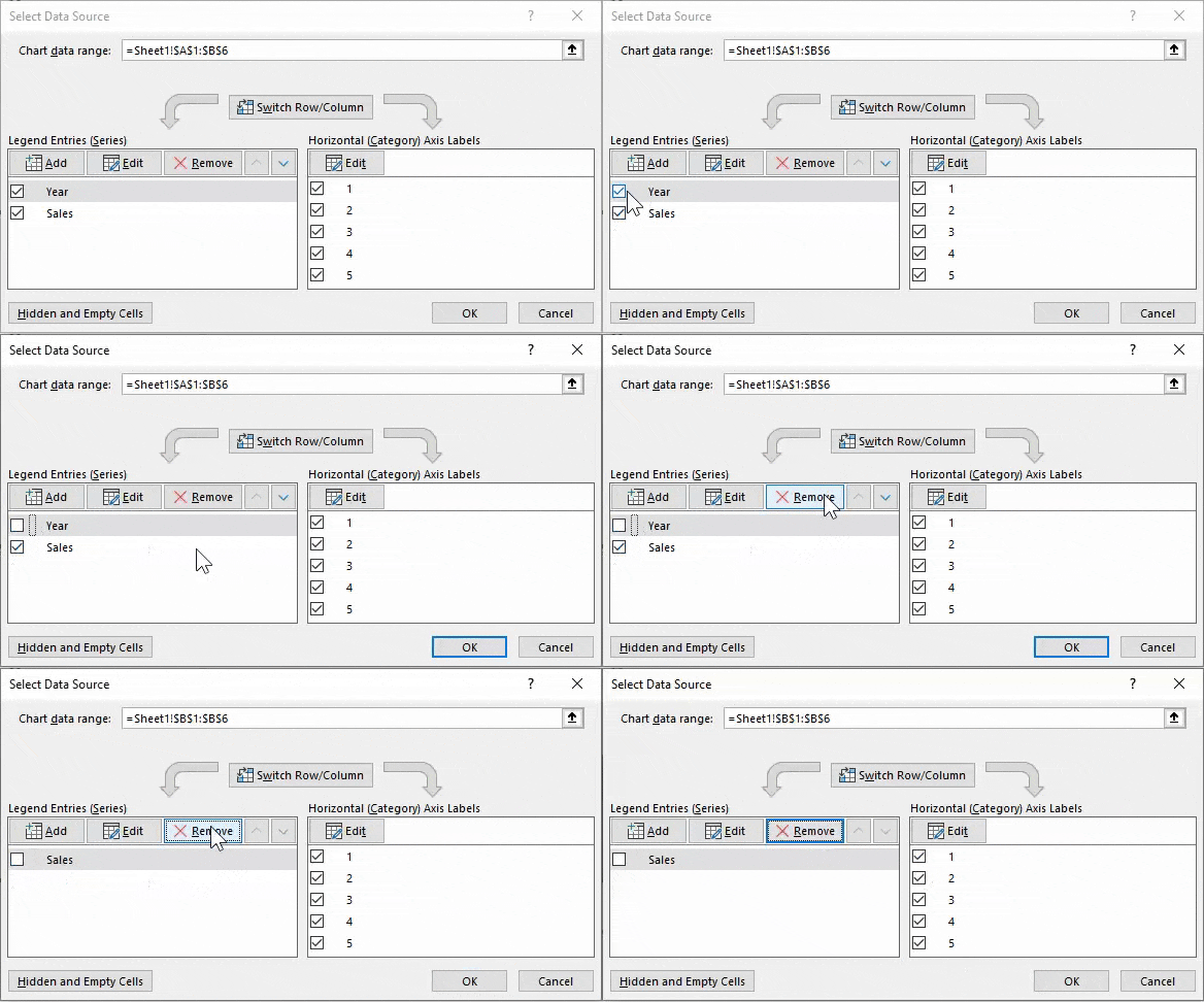
- Step 8: After removing it, we need "Year" to appear on the X-axis. So, we must click on the "Edit" button on the right-hand side.
- Step 9: Now, select the "Year" range as the reference.
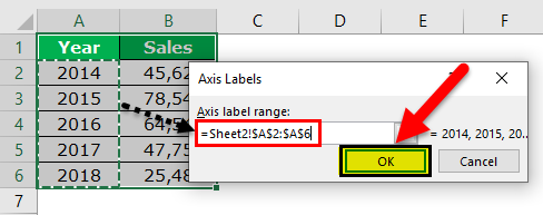
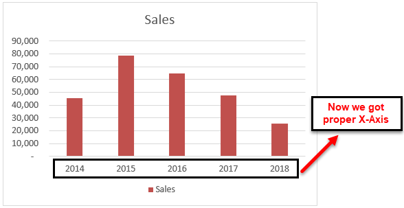
- Step 10: Click on "OK" to back to the previous window. Again, click on the "OK" button to complete the chart building. We have a chart ready now
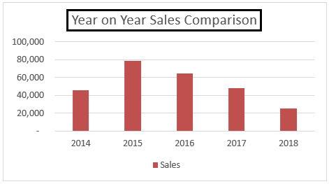
- Step 11: We need to change the chart's name to "Year on Year Sales Comparison." To change the chart title, double-click on the chart title and enter the chart title.
- Step 12: Add "Data Labels." "Data Labels" are nothing but each data bar's actual numbers. Let us show the data labels on each bar now.
Then, we need to right-click on one of the bars and select "Add Data Labels."
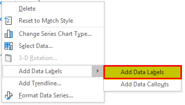
Now, we can see data labels for each label.
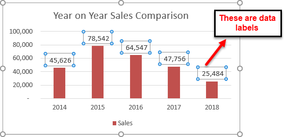
- Step 13: The next thing in the beautification process is removing gridlines. Gridlines in excel are the tiny gray-colored line in the chart plot area.
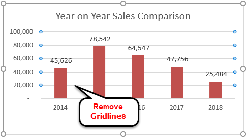
Select the gridline and press the "Delete" key to delete them. As a result, we will have a chart without gridlines.
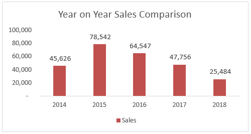
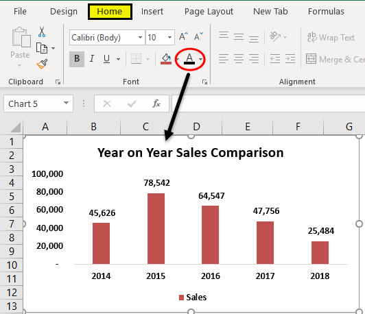
- Step 14: Change the color of the chart fonts to black. Select the chart and the black font color in the "Home" tab.
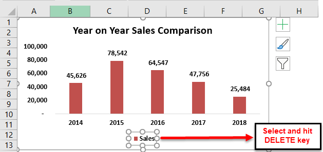
- Step 15: Since we have only one set of data in this chart, we need to remove the legend from the chart.
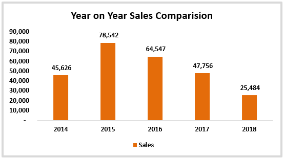
- Step 16: We can change the default column bar color to any of the colors as per our wish under the "Home" tab. Select the bar and choose the color of your choice.
Things to Remember
These are the processes involved in creating a chart. Below are some points to remember here.
- It will cover all the things you should know about excel chart creation. Up until Excel 2007, version Excel had its wizard tool, which would have guided the beginners in creating charts in Excel. But, from Excel 2007 versions, they eliminated "Chart Wizard" and integrated ribbon interface excel, which is far better than the traditional "Chart Wizard."
- Under "Select Data," we can select and delete unwanted things.
- If Excel does not give you the proper X-axis, you need to follow Steps 8 and 9.
- We must show legends only in the case of two or more items. In the case of a single item, remove the legend.
