Table Of Contents
What Is Death Cross in Stocks?
A death cross depicts a stock's price weakness. Every stock that trades on an exchange has a moving average. The cross pattern highlights the short-term decline in the moving average stock price. So, it is a bearish technical analysis indicator formed when a stock's short-term moving average crosses below its long-term moving average, indicating a potential trend reversal toward declining prices.

The moving average is the relative closing price of a stock. Alternatively, it could be a commodity, index, security, or cryptocurrency. Analysts study moving averages minutely to predict stock movements. Specifically, analysts compare a stock's 50-day moving average with the 200-day moving average. Usually, cross patterns indicate a bearish run.
Table of contents
- What is Death Cross?
- The death cross is a dramatic name for a price chart pattern.
- It depicts short-term price declines in a stock, commodity, index, or cryptocurrency.
- The golden cross is the opposite of the death cross. The golden cross indicates a bullish trend; the short-term moving average surpasses the long-term moving average.
- Many financial experts describe the cross pattern as a signal that hints at an upcoming shift in market trends—from a bullish to a bearish trend.
Death Cross Stock Pattern Explained
A death cross is a technical chart that depicts price weakness. It studies the price variation in a stock and projects volatility. This chart pattern applies to stocks, indices, commodities, and even cryptocurrencies. Therefore, analysts and traders use it for a wide range of applications.
For example, the chart pattern can use the moving average of stocks to understand price drops. Generally, when a death cross pattern appears on the chart, it signifies an upcoming bearish trend. For calculating the cross pattern, analysts use the 50-day moving average. Then, they check if it is trading below the 200-day moving average.
Simply put, this stock chart elaborates the price action of any stock at a given time. The entire pattern is categorized into three phases:
- The upward trend of security to its peak.
- Decline to the death cross point.
- Continuation of price decline.
In finance, stock chart patterns help traders predict the future price movement of a stock or index. However, there is another approach; investors consider it a signal to buy the stock at a low price and average their investments. Therefore, the death cross is often seen as an investment opportunity.
Chart
The Nasdaq Composite Index fell into a death cross. It happened after a long time, last in April 2020, when the pandemic and its severe impacts drastically sabotaged the U.S. equity markets and the world economy. The death cross appears when a stock's 50-day moving average declines below its 200-day moving average.
In the chart below, the black thread represents the Nasdaq Composite Index, the blue thread represents the short-term moving average (50 days), and the yellow thread signifies the long-term moving average (200 days).
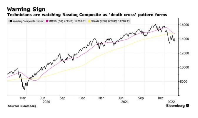
On the upper right-hand side, it is visible that the short-term moving average crosses below the composite fund's long-term moving average. Hence, a death cross appears. A death cross has been a lagging indicator from its past, which means the fund or stocks have already been impacted by the time it appears. For example, the index declined by 16%, and some investors used it to analyze long-term trends. This chart formation occurred in June 2000 when the dot com bubble burst and again during the 2008 financial crisis.
In the TradingView chart of Titan Company Ltd, a Death Cross is clearly marked, where the yellow 50-day moving average line intersects the 200-day moving average line from below. After that, a spell of downtrend is noticeable, which proves the pattern. In the chart, there is another Death Cross, around 6th June 2022, where a similar situation takes place, and after that, the stock experiences a significant downtrend over one month. This movement is more vital than the one that has taken place at the end of the chart. The pattern’s movement as a lagging indicator is also proved in the chart because each time it appears, the prices have already started to fall a few trading sessions before that. Therefore, the stock prices are affected even before the indicator informs the trader about the price fall.
This is totally opposite to the Golden Cross that has happened when the yellow 50-day moving average line crossed the 200-day moving average line from above, and the stock has experienced an uptrend for the next four to five months.

Examples
Let us look at death cross examples to understand stock chart patterns better.
Example #1
In the commodity market, oil is often referred to as black gold. But in September 2022, oil witnessed a terrible downfall. Oil prices plummeted by 20%. The decline was observed due to the following reasons:
- The economic slowdown.
- Energy crisis.
- Rough monetary policies by the central banks of the west.
The drop in prices eventually caused a cross pattern on the standard chart of USOil. Initially, there was a deviation from the cross pattern—investors were hopeful of a break from the downward trend. The oil market is complex, and oil is still in short supply.
Example #2
AbbVie is a US pharmaceutical company. The company stocks drew investors' attention when a cross pattern was formed on the company chart. This alerted the investors of a bearish trend expected shortly. In September 2022, the stock traded at $139.55. The cross pattern offers an opportunity to buy low and average investments.
Nonetheless, seasoned traders do not follow the cross patterns blindly. Instead, they consider it an indicator and take short positions. For decision-making, veteran investors prefer other reliable indicators—company fundamentals and financials.
In most instances where a cross pattern is seen, stock prices exhibit downward trends. But, if the price decline is inconsistent, the stock price will bounce back. Such a scenario would be considered a false positive or a false pattern signal. Many indicators, like the MACD, can gauge the strength of the cross-pattern signal. Some experts treat the cross pattern as a lagging indicator.
Death Cross vs Golden Cross
Now, let us look at the death cross vs. golden cross comparisons to distinguish between them.
- Death cross signifies a drop in the price of securities and commodities. In contrast, the golden cross depicts an increase in stock price.
- The former shows a downward trend, and the latter indicates an upward trend.
- The former is used in a bearish market, whereas the latter is used in a bull market scenario.
- The former is defined as a shift from a bull market to a bear market, and the latter replicates an opposite shift— from a bearish to a bullish trend.
- For calculating the former, analysts use the 50-day moving average. They check if it is trading below the 200-day moving average. In contrast, to identify the latter, analysts check if the 50-day moving average resembles a 200-day moving average.
For professional-grade stock and crypto charts, we recommend TradingView – one of the most trusted platforms among traders.
Disclosure: This article contains affiliate links. If you sign up through these links, we may earn a small commission at no extra cost to you.

Frequently Asked Questions (FAQs)
Both are technical chart patterns. They depict short-term price variation in security. It could be a stock, commodity, index, or crypto. The death cross reflects price weaknesses, whereas the golden cross depicts an increase in price (bullish trend). Thus, both patterns reveal contrasting trends.
A shift in market trend is observed when a cross pattern is observed in the price chart. This shift lasts around twelve months. Thus, analysts consider cross patterns an indicator of bearish trends. A drop in stock prices is not necessarily bad news; it offers the perfect opportunity to buy low.
The cross pattern is important for the following reasons:
- Cross patterns indicate the stock's price weakness.
- Analysts study the moving average variation to predict price movements.
- Intraday traders must interpret the cross pattern correctly.
Recommended Articles
This has been a guide to what is Death Cross. Here, we compare it with the golden cross and explain its chart and examples. You can learn more about it from the following articles –
