Table Of Contents
What Is Data Visualization?
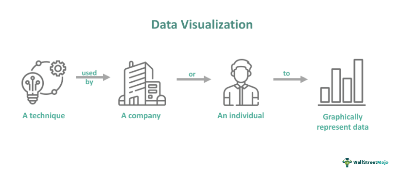
Data visualization is the visual or graphical representation of data and information. Business owners or employees use this technique to communicate complicated data-driven insights and data relationships in a straightforward manner so that non-technical audiences can easily understand without any confusion.
This method is crucial for analyzing substantial information and making data-driven decisions. One must also note that data scientists and analysts use graphical representations to spot and explain trends and patterns. There are different types of data visualization. Some of them are tables, tree maps, area and line charts, tables, and scatter plots.
Key Takeaways
- Data visualization meaning refers to a method businesses or individuals use to represent data in graphical form. It helps companies or individuals to communicate information faster and more efficiently.
- Charts, infographics, and tables are some types of data visualizations companies use. A few specific examples of graphical representations of data are line graphs, area charts, and boxplots.
- Unlike data visualization, data analytics involves examining data sets to draw conclusions regarding the details they contain and identify trends.
- There are various benefits of this technique. For example, it allows one to visualize relationships. Moreover, it conveys key insights more efficiently.
Data Visualization Explained
Data visualization meaning refers to a technique that involves representing information and data via common graphics, for example, animations, infographics, charts, plots, etc. It highlights the most crucial insights from datasets, making it easier for individuals to identify correlations, patterns, trends, and outliers.
Simply put, this technique helps understand what specific data means by presenting it in a manner that different types of audiences, including data experts, can access. This technique has these four vital purposes:
#1 - Data Illustration
This helps in communicating an idea, like a process or a tactic. Its use is common in learning settings, like centers of excellence, tutorials, and certification courses. That said, one can also utilize this method to represent organization processes and structures, making communication between the appropriate persons easier for certain tasks.
#2 - Idea Generation
The technique spurs idea generation across different teams in an organization. Businesses leverage it during design thinking or brainstorming sessions when starting a project by supporting different perspectives' collection and highlighting the collective's common concerns. Usually, such visualizations are unrefined or unpolished. However, they lay the foundation within a project, ensuring the team is in line with the issue it is trying to resolve for the main stakeholders.
#3 - Everyday Dataviz
Graphically representing data is a crucial step in the process of data science. It helps individuals and teams communicate information more efficiently to decision-makers and colleagues. Typically, the teams managing report systems utilize a defined template view to track performance. However, one must note that this technique is not restricted to performance dashboards.
#4 - Value Discovery
While value discovery assists different data professionals, including data analysts and scientists, in spotting trends and patterns within a dataset, everyday data visualization supports the succeeding storytelling once a new insight is found.
Types
The different types of data visualization are as follows:
- Tables: A table is a set of figures shown in columns and rows.
- Chart: Charts present information in a graphical, tabular form and display data along two axes. A chart can be in the form of a map, diagram, or graph.
- Dashboards: These are a collection of data and visualizations shown in one place. They help in presenting and analyzing data.
- Infographic: Infographics are a combination of words and visuals representing data. Usually, they involve the use of diagrams or charts. Check these Visme infographic templates for some examples.
- Geospatial: This is a visualization representing data in the form of a map using various colors and shapes to represent the relationship between specific locations and pieces of data.
Let us look at a few more specific examples of data visualization:
- Boxplots: Also known as box-and-whisker plots, boxplots are similar to pivot tables. They help visualize the vital characteristics of a dataset. For example, one can utilize boxplots to display the maximum and minimum values, upper and lower quartiles, and median values.
- Line Graphs: Line charts or line graphs are a highly effective yet straightforward staple for organizations or individuals to represent time-series data. From a visual standpoint, they are like scatterplots. However, they show data points separated by segregated by time intervals with a line joining the segments.
- Area Charts: These have similarities with line charts; they help monitor data over time. In area charts, the space between the x-axis and the plotted line is colored or shaded for visibility. These charts are specifically useful for individuals looking to highlight the difference between various variables. Moreover, area charts can be extremely helpful for measuring total volumes.
Process
The data visualization process involves the following steps:
#1 - Figure Out What Decision To Make
For individuals, the first step is determining what decision they are trying to make. Their visualization will not be clear if they are unclear on their decision.
#2 - Spot The Metrics Informing The Decision
The next step in the data visualization process is spotting the metrics that are relevant to the decision. For this, individuals must determine the particular points that would be the most useful for answering the decision question. After identifying the vital metrics, individuals must determine if they can accurately accumulate them. One may find some data points to be unavailable or inaccurate. In such a case, they generally have two alternatives: They can start a project to accumulate data or decide to adjust their question.
#3 - Develop The Story To Be Told
Individuals must develop a story utilizing their data. There are certain questions one can utilize to prepare their narrative. For example, whether the data is regarding comparison or if it is regarding categorization.
#4 - Choose The Right Visual
This part of the process is straightforward as the majority of the visuals naturally follow the story type one wants to tell. Individuals can consider the following examples:
- Time-based stories work well with line graphs.
- Bar charts are ideal for comparison stories.
Moreover, categorical stories generally require the use of tree charts.
#5 - Add Appropriate Elements To The Selected Visual
This step aims to make decisions regarding the visual that enhances the appeal and fosters comprehension simultaneously. For example, one may have to add callouts to their chart, add crucial context, or emphasize specific points to achieve that objective.
#6 - Label The Visual Clearly And Review It
This step involves noting the decisions made, giving a suitable title to the visual, and ensuring the units are accurate and incremented consistently. Also, individuals must ensure that they provide a legend to explain the colors' meaning.
#7 - Get The Visual Reviewed By A Non-Expert
Giving the visual to a person who does not have comprehensive knowledge regarding the underlying data or the subject matter is a crucial step. Ideally, they must understand the story being communicated without any problem. However, if they cannot understand, taking a few steps back is necessary. In most cases, the issue is the selection of an incorrect chart for presenting the data.
Examples
Let us look at a few data visualization examples to understand the concept better.
Example #1
Suppose GripMaster Tires, a tire manufacturing company, witnessed a 300% growth in revenue in two years. The volume of data and information generation over that period became overwhelming for the company to handle.
Hence, the company's management team used data visualizations to provide team members across different departments with useful insights. This enabled the team members, even the non-tech-savvy ones, to understand the data quickly. The valuations tracked budgets, expenses, cash flow, and other key financial metrics.
Example #2
Suppose the management team of Quirky Prints, an apparel and clothing company, decided to prepare sales data visualizations, which included the following elements:
- Customer retention and growth
- Quota attainment
- Customer acquisition cost
- Sales cycle's average length
- Customer lifetime value
Gaining insight into these key performance indicators via visualization helped the company's top officials make informed business decisions.
Advantages And Disadvantages
The benefits and limitations of graphically representing data are as follows:
Advantages
- Graphically represented information and data are processed faster.
- This technique supports visual learners.
- Graphically representing data can convey insights that one may miss in conventional reports.
- It increases sales and productivity.
- This technique enables individuals to visualize relationships.
- It helps spot trends easier and make informed business decisions.
- This technique helps communicate data to non-experts, making the data actionable and accessible.
Disadvantages
- The clarity in explanation depends on the audience's focus. As a result, if individuals do not focus correctly, they may skip the core messages.
- If the design is not correct, it may confuse the audience.
- The information communicated could be inaccurate or biased.
Data Visualization vs Data Analytics vs Infographics
The meaning and purpose of data visualization, infographics, and data analytics n lead to confusion for many individuals. To avoid it, one must know their critical differences. So, let us look at them.
| Data Visualization | Data Analytics | Infographics |
|---|---|---|
| It involves graphically representing data. | Data analytics involves analyzing datasets. | Infographics are a collection of data visualizations. Moreover, they include additional elements like graphics and narrative. |
| This technique aims to communicate information efficiently, clearly, and quickly. | Its main objective is to help organizations make better business decisions. | Unlike data analytics, the key purpose of infographics is to make information more interesting and straightforwardly present complex data. |
| The different types of data visualizations are charts, tables, infographics, etc. | Descriptive, prescriptive, and predictive analytics are a few types of data analytics. | A few types of infographics are statistical, hierarchical, informational, and timeline infographics. |
