Table Of Contents
Key Takeaways
- A control chart is a statistical instrument that helps measure and control a process's performance. Organizations use this method to identify deviations or irregularities in production or operational processes.
- These charts allow organizations to recognize the problem areas and take corrective measures. It offers a visual representation of the process performance and assists in determining whether the process is in control.
- They are typically used in quality control and product improvement as they are valuable in maintaining consistency and quality in production.
What Is Control Chart?
A control chart is a statistical instrument that tracks and controls a process and its performance over a specific period. The purpose of control charts is to identify and prevent any irregularity or deviations in the operational or production process. It is widely used in an organization's quality control and process improvement domains.

A control chart in quality control offers a visual representation of the process performance by plotting data points over a certain period. Companies can determine in the early stages when a process is out of control and take corrective measures promptly with the help of these charts.
How Does Control Chart Work?
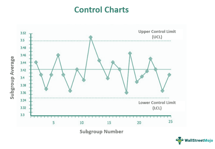
A control chart works by visually displaying the process performance over a particular period and allowing the detection of variations or irregularities. A control chart in quality control comprises a center line that signifies the process's average or target value. Additionally, it contains the upper control limit (UCL) and the lower control limit (LCL) that prescribe the acceptable range of variation.
The control limits are generally established at a specified number of standard deviations from the process average or mean. The data points are plotted on the chart, with time on the x-axis and the measured values on the y-axis. Moreover, a center line signifies the process mean. The users study the patterns and trends in the plotted data to understand whether the process is in or out of control. The data points within the control limits suggest that the process is in control. However, the points lying beyond the control limits indicate that there are variations that the user must investigate.
Components
The control chart components are:
- Data Points: These are the actual observations or measurements the users collect from the monitoring process. Users plot these data points on the chart to visually represent the process performance over time.
- Centre Line: This line represents the process mean or target value. The users calculate this based on the data they have gathered. It acts as a reference point on the chart.
- Control Limits: The users calculate the control limits using statistical methods. They usually set these limits as certain standard deviations above and below the process mean. The lower control limit (LCL) and upper control limit (UCL) create a range within which the process is expected to operate.
- Time Axis: The time axis lies on the chart's horizontal x-axis. It shows the progression of time and allows for the process execution's analysis over a specific period.
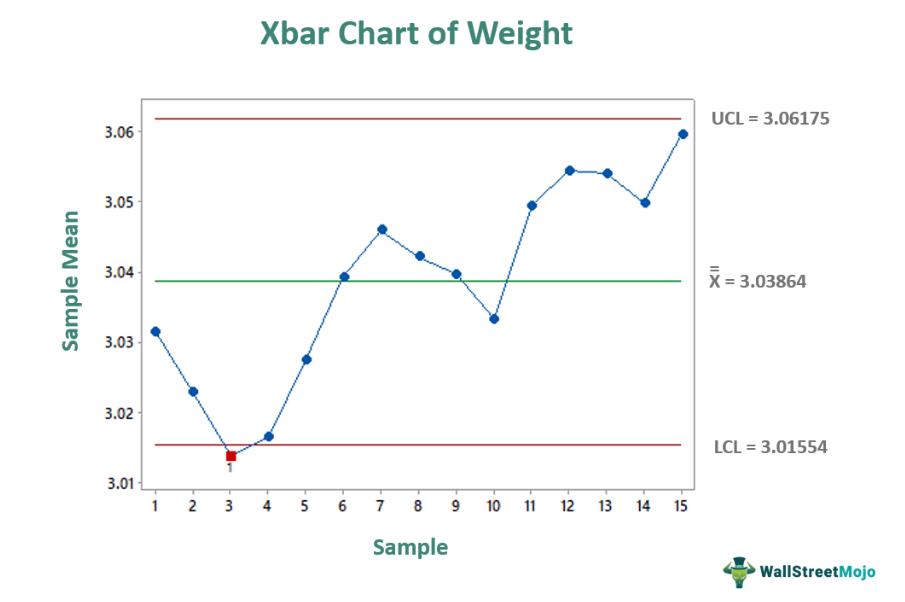
- Out-of-Control Indicators: These signals alert users about potential issues in the process. They can include data points exceeding the control limits, trends, or other established rules for detecting out-of-control situations.
Types
The types of control charts are:
- Individuals Chart (I-chart): Users can employ this chart type to gather and plot individual data points over time. They are suitable for tracking processes where each observation is independent, like measurements or counts.
- X-Bar and R Chart: This chart type comprises two parts which are the X-bar chart and the R chart. The X-bar chart tracks data subgroups' average or mean values, and the R chart tracks the range or variability within those subgroups.
- X-Bar and S Chart: In this chart type, the X-bar and S track the average values of subgroups. However, it uses the standard deviation to measure variability within those subgroups.
- Attribute Chart: These types of control charts are instrumental in monitoring processes where the data is categorical instead of numerical values. Some examples are tracking the number of defects in a product and the presence or absence of a specific feature.
Examples
Let us discuss a few examples:
Example #1
Suppose Arena Electronics Ltd. is a company that manufactures televisions. Sam, the quality control manager in the company, wanted to track the number of dead pixels on 55-inch LCD screens.

The technicians in the company recorded the number of dead pixels for each screen. Each subgroup comprises a different number of screens. John used a chart to track the average number of dead pixels per screen. This is an example of a control chart.
Example #2
Let's assume Crunchy Chocs Ltd. is a company that manufactures chocolate. John is the quality inspector in the company, and he wanted to verify whether the products are within the weight limits.

So, he took a subgroup of 10 packets in 2 hours and plotted a chart to track the weight of each product. This is an example of a control chart.
Uses
Control charts are primarily effective in quality control and process improvement as they help track and control the process execution. They assist in identifying patterns, variations, and abnormalities in data over time, allowing organizations to take timely corrective actions. In addition, organizations employ them for tracking process specifications like measurements, counts, or categorical data.
These charts offer a graphical representation of the effectiveness of the process and enable organizations to recognize deviations, lessen defects, boost operations, and maintain consistent quality. The purpose of control charts is to allow users to identify if the processes get out of control on time.
Advantages And Disadvantages
The control charts advantages are:
- They offer a graphical representation of process performance, making it easier to identify and interpret data patterns and trends.
- Using control limits, these charts can detect any variation or abnormality early on in the process. It helps users in taking corrective actions on time.
- They allow users to constantly improve the process by offering valuable insights about its performance. They underscore areas for optimization and promote evidence-based decision-making.
- This chart assists in maintaining consistent quality standards by recognizing and acknowledging any process divergences. Moreover, it helps reduce defects and enables users to comply with the product specifications.
The disadvantages are:
- These charts depend on accurate and reliable data. If the data collection is flawed or incomplete, it can result in inaccurate interpretations and erroneous decision-making.
- They require advanced statistical knowledge and expertise for accurate data interpretation. Misinterpretation of chart patterns or inaccurate analysis can lead to ineffective measures and missed opportunities for improvement.
- Implementing these charts requires time, effort, and resources to gather and analyze the data, set control limits, and maintain the tracking process. Thus, employing these charts can be challenging for organizations with limited resources.
Control Chart vs Run Chart vs Histogram
The differences are as follows:
- Control Chart: These charts primarily aid in monitoring and controlling a process's performance over time. It identifies variations, trends, and out-of-control conditions. They plot individual data points or subgroup averages over time with the preestablished control limits to determine whether the process is in control.
- Run Chart: These charts help to visualize and analyze data over a stipulated time to identify patterns, trends, and shifts in the process performance. They offer a picture of individual data points or measurements in chronological order without including any control limit or statistical calculation.
- Histogram: They help visually display the data distribution and recognize the frequency or occurrence of different values or ranges within a dataset. They represent data usually through bars where the height of each bar signifies the frequency or count of data falling within a particular degree or category.
