Table Of Contents
What are Contour Plots / Surface Charts in Excel
The contour chart is part of the contour plot in Excel used to display the set of three-dimensional data in the form of a Mesh surface. We can use this chart to find the optimum combination of two sets of data points. We can construct these charts by using three variables, i.e., “X, Y, and Z.” Out of these three variables, two are independent, plotted on the horizontal axis, and the remaining independent variable occupies the vertical axis. So, this chart shows the relationship between data points.
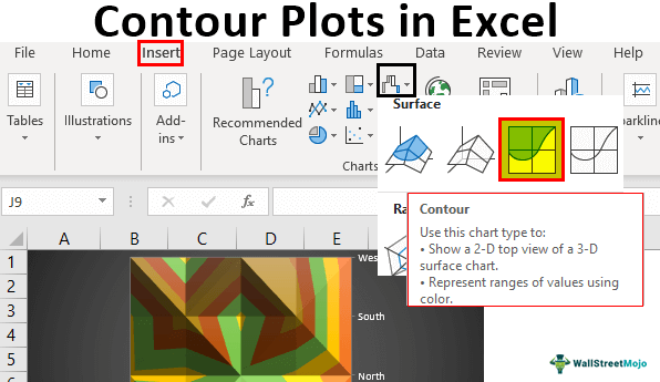
How to Create a Contour Plot / Surface Charts in Excel? (Step by Step)
Below are the examples to be considered.
To create any chart, we need some data. For this Contour plot example, we have created the below sample data.
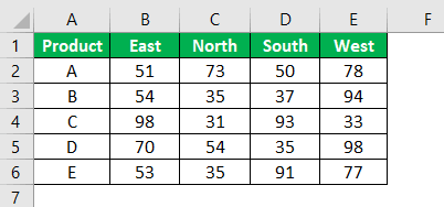
We will show you how to build a contour plot with Excel using this data.
Follow the below steps to create a surface chart in excel.
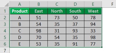
Step 1: We must first select the data in the Excel worksheet.
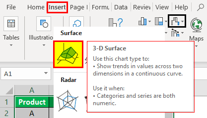
Step 2: Then we must go to Insert >>> Charts >>> Stock, Surface, or Radar Chart.

Step 3: Once we click on the "Stock," "Surface," or "Radar" chart, we can see below the preview. We will select the first chart under the surface chart.
Step 4: Now, we will have the chart as shown below.
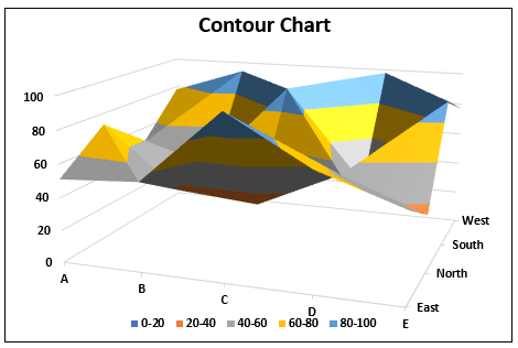
Step 5: Now, we need to customize this chart. To customize the chart, we need to go to the "Format Plot Area." A dialog box will open if we press "Ctrl + 1" by selecting the chart.
Once we press "Ctrl + 1," we can see the format window opening to the right end of the chart.
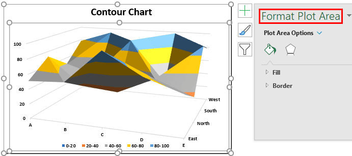
Not only through this, but we can also make quick customize by pressing the "plus" button, which appears on the selection of the chart.
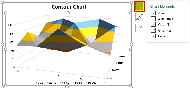
Step 6: One of the important formats we can do is change the chart's color. To change the chart's color, we need to go to Design >>> Change Colors.

Step 7: We must click on the " Change Colors" drop-down list to see all the available colors on this chart.
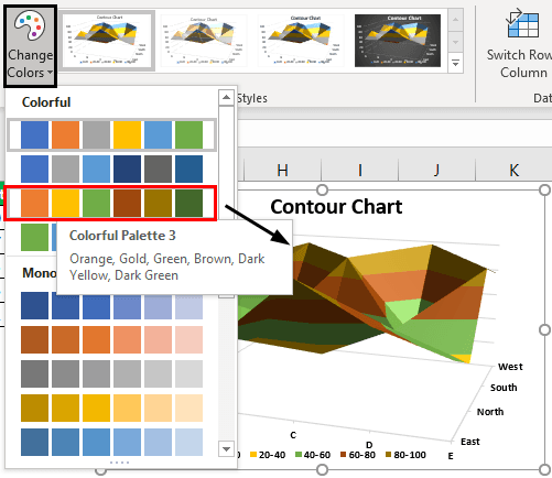
Now, we can see the different colors on the chart's surface.
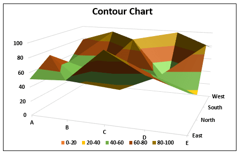
Based on the length of our numbers size, we can eliminate legends.
Step 8: Now, we can change the style of the chart. To change the style of the chart, go to "Design," and under "Chart Styles," we can select the style we want to apply.

We have selected “Style 4,” and our chart looks like the one below.
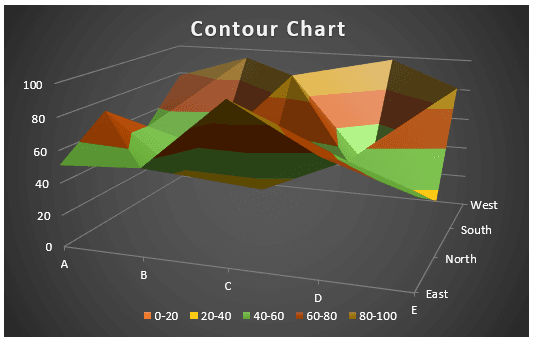
Contour is Part of Surface Chart
The contour chart has always been part of the surface chart. We can also change the existing chart from "3D Surface Chart" to "Contour Chart."
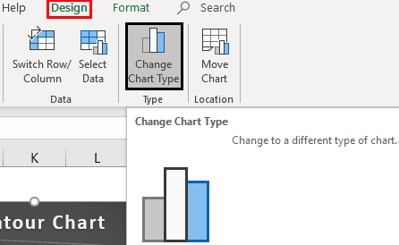
To change the chart type, we must select the chart and go to Design >>> Change Chart type.
Under this option, we can see many charts. For example, place a cursor on the third chart under "Surface"; that is what the contour chart is.
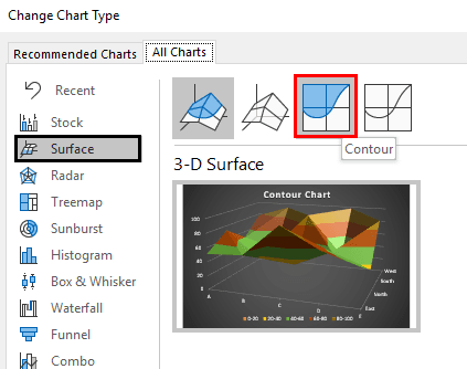
We will apply this chart and click on "OK." We will have the below chart.
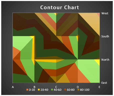
So, this is the basics of creating a contour plot with Excel. Then, based on the different formatting and chart types, we can modify the chart.

