Table of contents
What is a Comparison Chart in Excel?
When an important decision needs to be made, we may want to look at the region, city, or other category-wise sales values. Unfortunately, reading values from a table summary is not a quick option because looking at numbers against each different category takes enough time. So, instead of showing the table summary alone, we can offer those numbers in charts called a “comparison chart.”
For example, you want to know the sales value of your product in two different regions of a country. In such cases, we may use the Excel comparison chart that can help to compare and let us know the margin value of a product in two different regions in a graphical manner and make it easier to understand whether our data has numerical and textual content.
How to Create a Comparison Chart in Excel? (with Examples)
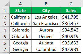
Above are the state-wise and city-wise sales values. When we look at the data, we have the same state for the two cities. For example, for the state of “California,” we have “Los Angeles” and “San Francisco” cities; to compare these two cities’ values against each other in the same city. We need to create a comparison chart in Excel.
We must follow the below steps to create a comparison chart in Excel.
1. First, we must copy the above table data to Excel.
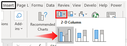
2. We must select the data and insert “Column Chart” in Excel.
3. Now, we have a default chart like the one below.
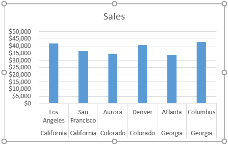
It is not a clear comparison chart yet. To make it clear, we need to modify the data slightly.
4. Since we have the same state name for multiple cities, let us merge state values into one cell.
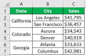
5. Now, let us look at the chart.
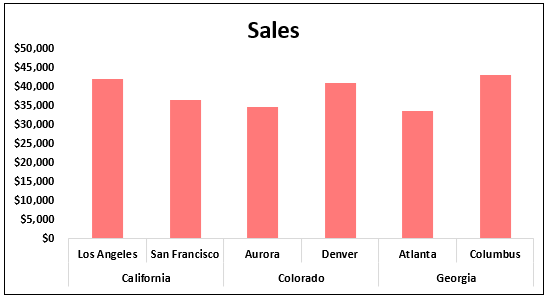
We can see only one state name for multiple cities on the horizontal axis, unlike the previous one with state names for all the cities. We still need to make it clear by adding space between each state.
6. A simple technique can add space between each state. After every state name, insert a blank row.
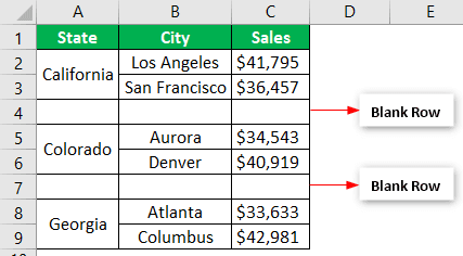
Now, let us look at the chart again.
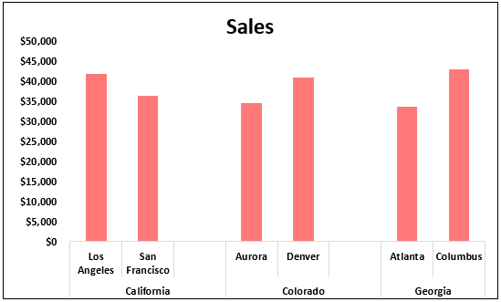
We can compare city-wise sales in the same state from the above chart. By adding an extra empty row, we can make this difference.
Use Combo Chart as Comparison Chart in Excel
Above is one way of comparing values in the same category. Similarly, we can also use the “combo chart” to compare values. For example, look at the below data.
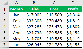
We must insert a column chart for this data by copying the data to an Excel worksheet. Then, when the column chart is inserted, we can have a chart like the one below.
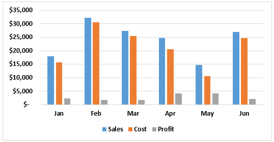
It is the general way of creating a column chart. But by making the “Profit” column bar a different chart, we can compare things even better.
Then, we must select the “Chart.” Finally, we can see two extra tabs in the ribbon, i.e., “Chart Design” and “Format.”
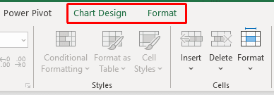
Click on ” Change Chart Type ” from the “Chart Design” tab.
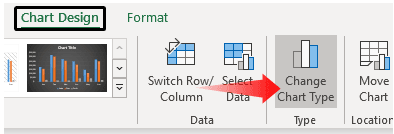
As a result, it will open up the “Change Chart Type” window.
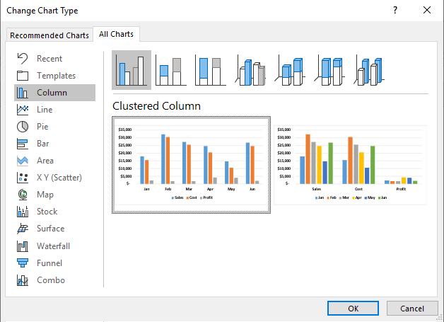
Then, click on the “Combo” option at the bottom.
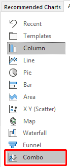
We can see combination chart types when selecting the “Combo” option. At the bottom, we can see the chart type for each series.
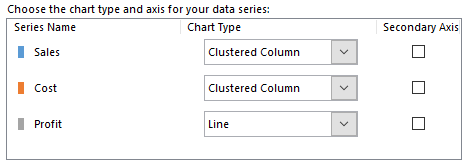
For the “Profit” column, we must select the chart type as “Line” and make it “Secondary Axis.”
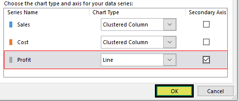
We must click on “OK” to have a comparison chart ready with two different charts.

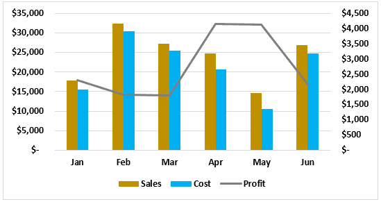
As we can see above, we have two vertical axes, one on the right side and the other on the left side of the chart.
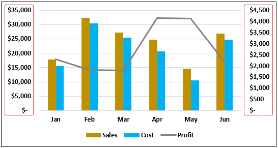
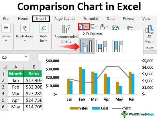
The right side vertical axis is for column chart bars, and the left side vertical axis is for the line chart. So, for example, from the above chart, we can see that for the month of “May” revenue is $15,000, and the cost is $11,000, but the profit is $4,000, so this shows that this month’s profit values are more than other months.
Things to Remember
- The Excel comparison chart can compare the multiple subcategory values under one main category.
- A combo chart in excel is best suited to compare values.
- It always has a secondary axis for a combo chart to read better.
