What Is Secondary Axis In Excel?
A Secondary Axis In Excel helps view the second dataset on a different axis because we cannot show two different data sets on a single axis. So this separate axis is called the “Secondary Axis” in an Excel chart.
For example, we have the data below of a student score for different subjects and his overall percentage.

We will plot a Bar Graph along with the Secondary Axis In Excel, as shown below.

The output is shown above, i.e., Marks are displayed in the form of Bars as the primary axis, and the Percentage in the form of Lines as the secondary axis.
Key Takeaways
- A Secondary Axis in Excel is a feature we use while displaying multiple variables or datasets separately on a single chart.
- The charts containing the Secondary Axis displayed, are also known as Combo Charts. We can add or remove the Secondary Axis to or from a chart.
- We can use the line chart, bubble chart, etc., as a combination along with the generated chart to display multiple datasets.
- After plotting the Secondary Axis, we can also change the secondary chart types as required, which will automatically modify the chart.
How To Add A Secondary Axis In Excel?
We will see how to add a Secondary Axis in Excel with the example given below.
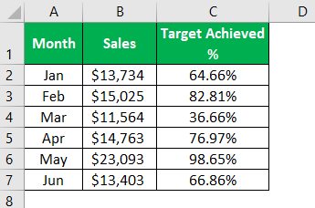
Here, we have two different data sets for each month. The first data set represents “Sales” numbers for the month. Next is to define the “Target Achieved %” for each month.
Both these numbers are not related to each other, so it is inappropriate to show them on a single axis.
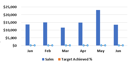
Below is the chart example if we show both numbers on a single axis.
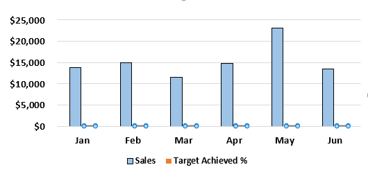
From the above, can you tell what the target achieved percentage is?
The problem is that the axis numbers of “Sales” are too high, and the “Sales Conversion” numbers are also less. So, we cannot show the trend with a single axis.
Since both the numbers are plotted under a single axis, we cannot tell the numbers of the smaller data set. Therefore, we cannot recognize other data along with the chart.
We can add the Secondary Axis in multiple ways. We will see each technique separately. Below is the image of the Secondary Axis chart.
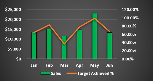
As we can see on the right side, another vertical axis shows the sales conversion percentage. Now, we will see how to add a Secondary Axis in Excel.
Examples
We will consider a couple of specific examples or the following methods.
- Method 1: Simple to Add/Remove Secondary Axis in Excel.
- Method 2: Manually Add/Remove Secondary Axis to the Chart
Method #1 – Simple to Add/Remove Secondary Axis in Excel
- Once you have applied the column chart, we will get a chart like this.
- We cannot see the sales conversion percentage column, so select the chart, go to the “Design” tab, and click “Change Chart Type”.

- It will open the below dialog box.
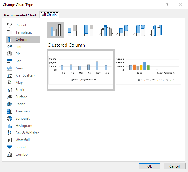
- Choose “Recommended Chart.”
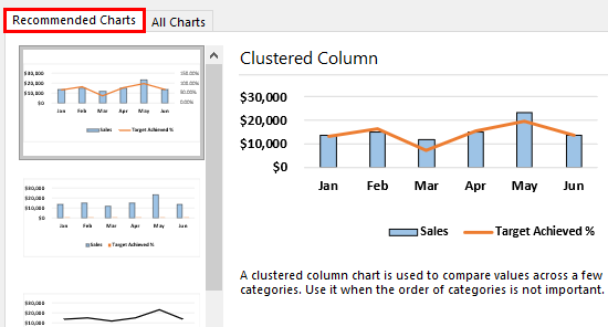
- Under this, we can see Excel has a recommended chart based on the data set. Choose the first- “Clustered Column Chart in Excel.”

- The preview shows that the sales conversion percentage comes under a Secondary Axis with a different chart type -“Line Chart in Excel.”

It looks easy, but we have one more method – manually. Let us see the method below.
Method #2 – Manually Add/Remove a Secondary Axis to the Chart
We cannot directly select the “Sales Conversion Percentage” columns in this method, so choose the chart and click “Format”.
- Under the “Format” tab, click on the drop-down list in Excel of “Current Selection” and select “Series Target Achieved %”.

- It will select the “Target Achieved %” column bars.
- Now, press Ctrl+1 to open the “FORMAT DATA SERIES” option.

- In this window, select “Secondary Axis.”
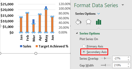
- We can get the following chart.

As we can see from the chart, it has given the “Target Achieved %” in the column bar with a Secondary Axis. But reading both the data in columns is not ideal, so we need to change the chart type to a line chart.
- Select the “Target Achieved %” column and click “Change Chart Type.”
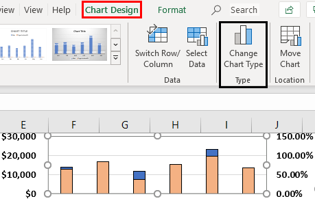
- In the below window under the combo chart in excel, select “Custom Combination”, in that, select “Target Achieved %” as “Line”, and click “OK”.
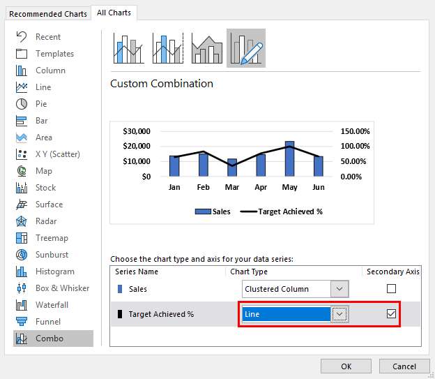
[Special Note: To Change a Secondary Axis in Excel, when we reach the above step, we can select the secondary chart options from the drop-down shown above.]
- Finally, we will have a secondary chart like the below one.
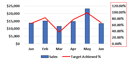
We can easily see the trend from one month to month from this chart.
Important Things To Note
- The Secondary Axis requires a different chart type from the primary axis chart. This type of chart is also called the “Combo Chart”.
- One can read Secondary Axis numbers from the right-side vertical axis.
- One can read primary axis numbers from the left side vertical axis.
Frequently Asked Questions (FAQs)
Why is Secondary Axis needed for a chart?
When plotting a chart with multiple variables or datasets, the generated chart cannot display all the variables on a single axis. Therefore, to view the required variable data, a Secondary Axis is needed in a chart.
What are the different Secondary Axis charts used?
For the Secondary Axis, we can use the Combo Chart, Line Chart, etc., from the Recommended Charts category in Excel. This option is available in Excel versions 2013 and above. In versions before 2013, we can manually generate a chart, select the required data or variable on the chart, and use the “Format Data Series”, as we considered in the Method 2 example.
How to read the Primary and the Secondary Axis in charts?
We can read the Axis in the created charts as follows:
a) The Primary Axis numbers are read from the left-side vertical axis.
b) The Secondary Axis numbers are read from the right-side vertical axis.
Recommended Articles
This article is a Guide to Secondary Axis in Excel. Here we add a separate axis in a chart, to view the other variables, example & downloadable Excel template. You may learn more about Excel from the following articles: –