Table Of Contents
What Is Bullet Chart In Excel?
Bullet chart is one of the charts we can create in Excel with just a few steps. Though it is not available by default, we can create bullet charts in Excel using stacked column charts and a few steps. Stephen Few invented an Excel bullet chart to analyze the performance against the standards.
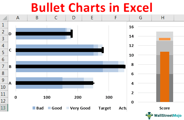
For example, when you collect the survey result from the public, you might be expecting a satisfaction level of 90%, which will be treated as a target. However, after collecting opinions, you may get a satisfaction level of 75%. You may show these numbers in a bullet chart to gauge the performance.
Key Takeaways
- A bullet chart was invented by Stephen Few to determine the conduct against the quality.
- The available bullet chart in Excel is not a built-in Excel. To make a bullet chart, one must add different other charts and customization.
- It is essential for Excel users to comply with all the necessary steps to make a bullet chart in Excel and not miss any steps of the bullet chart-making process.
Explanation And Uses
- Bullet charts are used to present data visually to know the given data is performing with respect to the target.
- Usually, bullet charts have different ranges or components such as target, actual, and other ranges.
- Visually, bullet charts appear as a center bar, vertical line and actual value.
How To Create Bullet Chart In Excel?
Bullet charts are used to identify the performance. Let us learn how to create bullet charts with detailed examples.
Examples
Example #1
Assume you are collecting opinions about your product experiment from customers. You have set the below bands to your customers to give satisfaction scores.
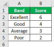
You have targeted an average score of 5 from the satisfaction survey, but you have got 4 as the average score. So now, we will show this in a bullet chart to visualize this. Below are the details we have entered in the worksheet.
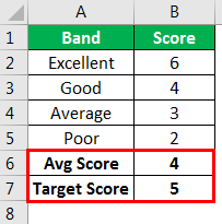
We must follow the below steps to create a bullet chart.
- We must select the data from A1 to B7 first. Then insert the "Stacked Column Chart" in Excel.

Now we can see the chart below.
- Select the chart. Under the design tab, select “Switch Rows/Columns.”

We will have a chart like the one below, where all the bars are combined.
The topmost bar (orange color) is the target in this chart. - We must select the "Orange Color" bar, right-click, and choose "Change Series Chart Type."

- Now, in the below window, scroll down and select the "Target" series in the below window. Next, check the "Secondary Axis" box and change the chart type to "Stacked Line with Marker."

Now, we can see the "orange dot" instead of a bar for the "Target Score" series.
- We will select the "Avg Score" bar, right-click, and choose "Change Series Chart Type."

We will see the "Change Series Chart Type" window. Check the "Secondary Axis " box for the "Avg Score" series from this window.
- Click "OK."It will come back to the chart, and now our chart must look like this.

- Now, select the blue-colored area and press "Ctrl + 1" as the shortcut key to open the format data series.
The data series makes the "Gap Width" 500% in this format.

- Select the target series “dot” and press “Ctrl + 1.”
Select “Fill & Line” >> Marker >> Marker Option and make below changes.
Now our “dot” is replaced by “Marker.” - Select each band bar and change the color from light grey to dark grey, starting from the top bar. And our chart must look like this now.

Note: We can choose a blue color for band bars as well. We can change the "Target" marker color and the "Avg Score" bar color.
Example #2
Now we will see how to build a multi bullet chart in a single chart in Excel. Below is the data we will use.
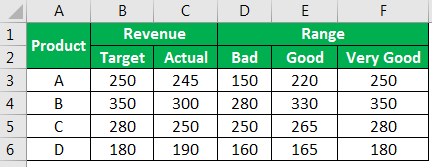
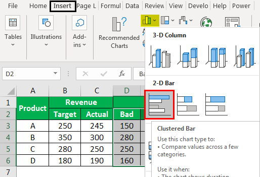
This table shows the target for each product and what is achieved. On the other hand, we have a range of values split into three categories, i.e., "Bad," "Good," and "Very Good."
For example, for Product "A," the target is 250, and the actual is 245. In the range, if 150 is actual, then it will be treated as "Bad," if 220 is actual, then it will be "Good," and if 250 is actual, then it will be "Very Good."
Let us create a bullet chart for this.
- Step 1: We must select D2 to F6 and insert the "Clustered Bar Chart."
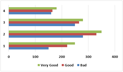
Now the chart will look like as shown below:
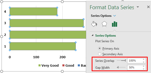
- Step 2: We willselect a green-colored bar. Press "Ctrl +1" and make the "Series Overlap" as 100% and "Gap Width" as 50%.
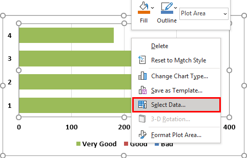
- Step 3: Right-click on the chart and choose "Select Data."
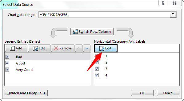
- Step 4: In the below window, click on “Edit” at the Horizontal (Category) Axis Labels.
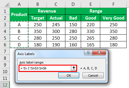
- Step 5: Now choose “Product Name” and click on “OK.”
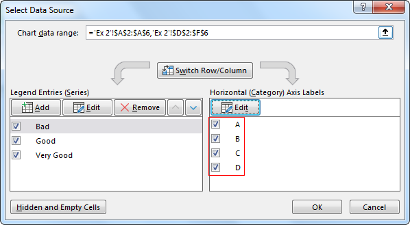
- Step 6: Now, we can see “Product Names” horizontally.
Select "Very Good" and move this to the top using the up arrow in the same window, as shown below.
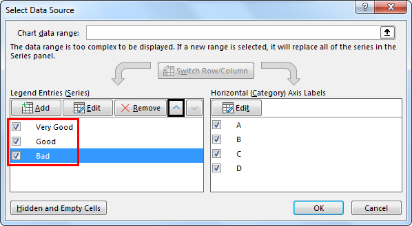
Arrange in this order "Very Good," "Good," and "Bad."
The chart will look like this.
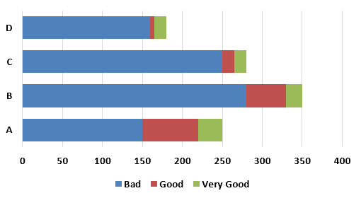
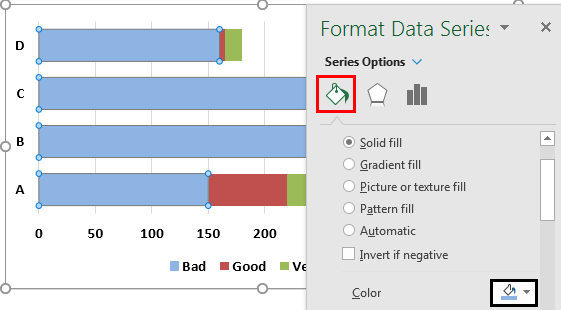
- Step 7: Now, choose a blue-colored bar and press "Ctrl + 1." Then, go to "Fill" and choose any dark fill colors.
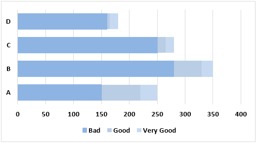
Similarly, for the remaining bars, fill with light colors of the same blue, and the chart should look like this, as shown below.
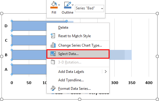
- Step 8: Right-click on the blue bar and choose "Select Data."
- Step 9: Choose “Target” values in the next window.
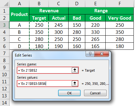
- Step 10: So, do the same for “Actual.”
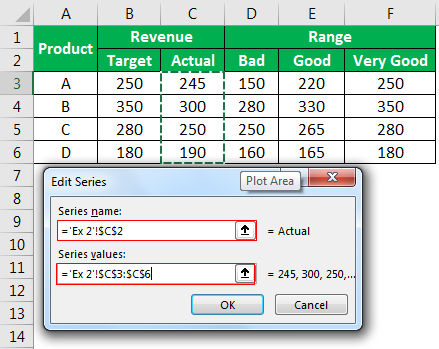
- Step 11: Click on “OK.” We will have a chart shown below.
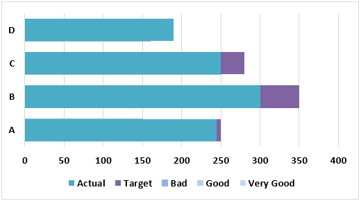
- Step 12: Right-click on the blue-colored bar and choose “Change Series Chart Type.”
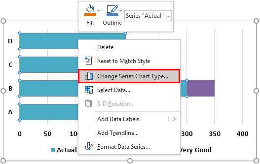
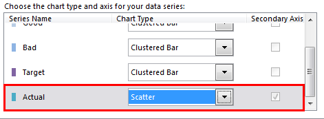
- Step 13: In the chart, choose the "X Y Scatter" Chart for "Actual in the change window."
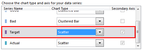
- Step 14: Repeat the same for the “Purple” bar.
Now, we will have a chart like this.

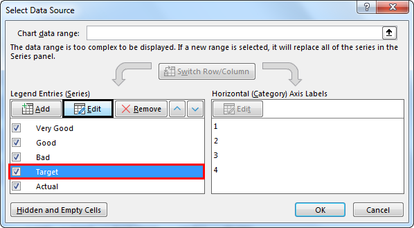
- Step 15: Right-click on the purple dot and choose the "Select Data" option. Next, select "Target" and choose the "Edit" option in the next window.
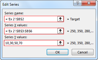
- Step 16: In the next window, for X values, choose values from B3 to B6, and for Y values, enter the number 10,30,50,70.
- Step 17: Similarly, for "Actual" select C3 to C6 for X values and for Y values enter 10,30,50,70.
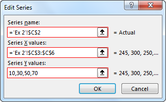
- Step 18: Click on "OK." We will have a chart like the one below.
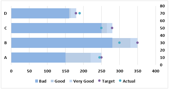
- Step 19: Click on Blue Dot >>> Design >>> Add Chart Element >>> Error Bars >>> Percentage.
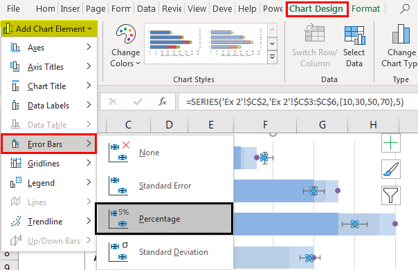
Now, the chart will look like this.
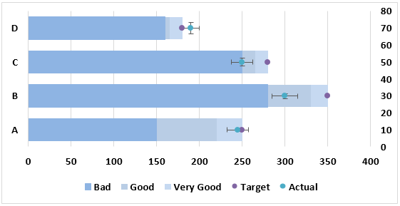
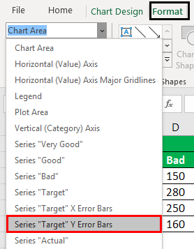
- Step 20: Under the "Format" tab, choose "Series Target Y Error Bars."
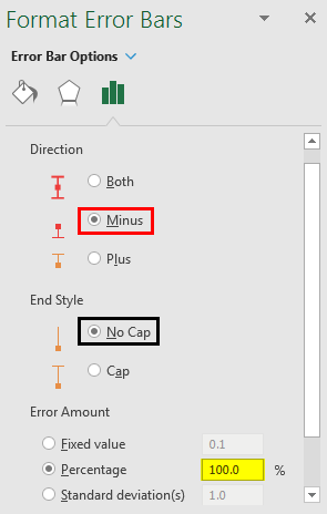
- Step 21: Now, on the "Format" data series, choose "Minus" and "No Cap." For percentage entering 100.
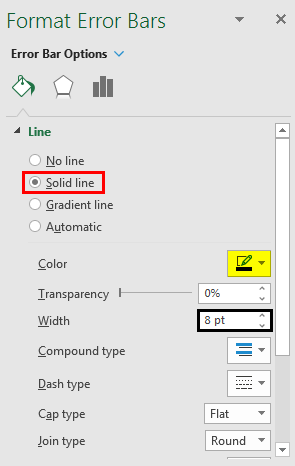
- Step 22: Now make the line style as 8 pt for width.
- Step 23: Now, click on a purple dot and repeat the same steps. While adding error bars, follow the below image instructions.
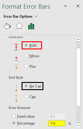
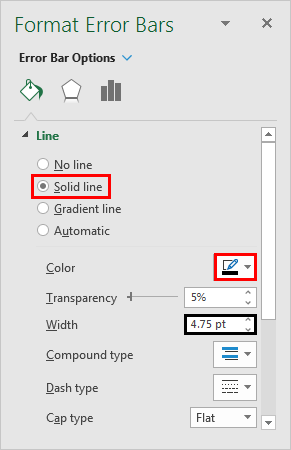
Step 24: In the same format, data series, go to “Line” style, and make the below changes.
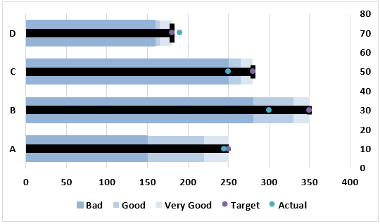
Now the chart looks like the one below.
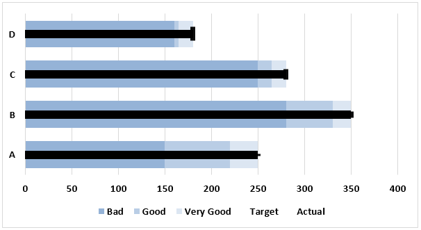
- Step 25: Select the dot and make the marker as no line and our bullet chart is ready to rock. Wow!!!
Example #3
Consider the below example.
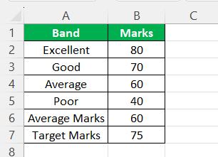
We must follow the below steps to create a bullet chart.
We must select the data from A1 to B7 first. Then insert the "Stacked Column Chart" in Excel.
Select the chart. Under the design tab, select “Switch Rows/Columns.”

We will have a chart, where all the bars are combined.
The topmost bar is the target in this chart.
We must select the topmost bar, right-click, and choose "Change Series Chart Type."
Now, in the below window, scroll down and select the "Target" series in the below window. Next, check the "Secondary Axis" box and change the chart type to "Stacked Line with Marker."
Now, we can see a dot instead of a bar for the "Target Score" series.
We will select the "Avg Score" bar, right-click, and choose "Change Series Chart Type."
We will see the "Change Series Chart Type" window. Check the "Secondary Axis " box for the "Avg Score" series from the window.
Click "OK."
Now, select the blue-colored area and press "Ctrl + 1" as the shortcut key to open the format data series.
The data series makes the "Gap Width" 500% in this format.
Select the target series “dot” and press “Ctrl + 1.”
Select “Fill & Line” >> Marker >> Marker Option.
Now our “dot” is replaced by “Marker.”
We can see the bullet chart as shown in the below image.
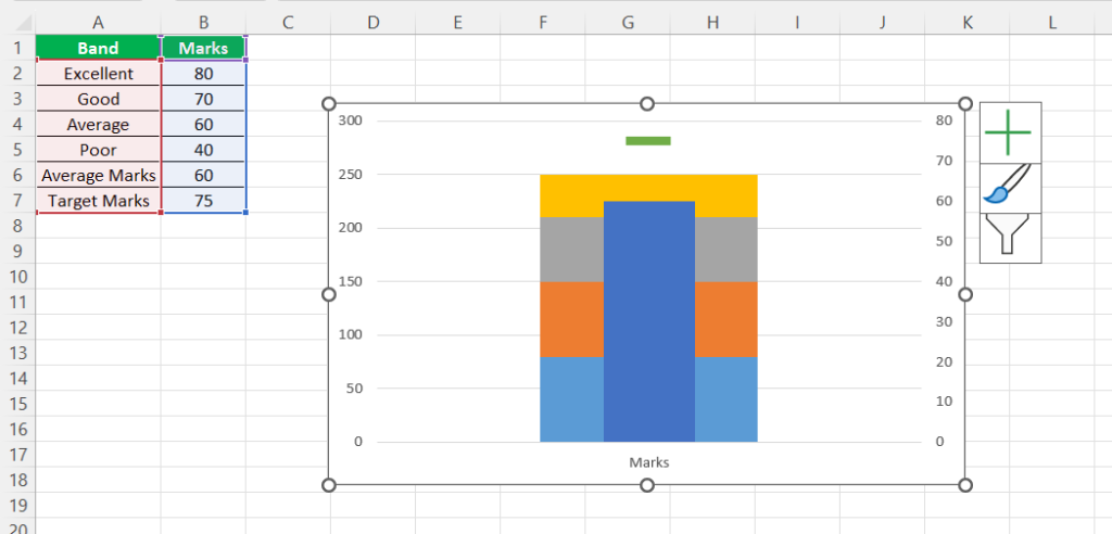
Likewise, we can create bullet charts in Excel.
Important Things To Note
- The bullet chart is not a built-in Excel chart.
- By adding various other charts and customization, we need to create this one.
- Follow all the steps to create a neat bullet chart in Excel. Do not skip any steps.

