Table Of Contents
What is a 3D Scatter Plot Chart in Excel?
A scatter plot chart is often referred to as the XY chart in Excel because of the two kinds of data related to each other. We will have two data sets; those numbers are not just numbers. Instead, they will have a relationship between the two. To show those two sets of numbers graphically in Excel, we have a chart called “Scatter Chart in Excel,” This article will show you how to create a 3D scattered plot chart in Excel.
For example, a company’s advertising expenses and income incurred from the advertising. Both (advertising expenses and income) values are placed in two separate columns to create a scatter plot. It would plot the column on the left on the X-axis and the right on the Y-axis. It will help you know whether the data is positively/negatively correlated and how much they correlate.
Where to Find the 3D Scatter Plot in Excel?
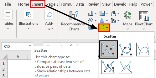
A Scatter plot in excel is an in-built chart located under the Insert ribbon tab in Excel.
Go to Insert > Chart > Scatter Chart
How to Create 3D Scatter Plot in Excel? (with Example)
We need corresponding data to create a scatter plot XY chart in Excel. So, I have made the below data, which has a relationship between the two.
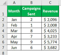
Here, we have two sets of data every month. The first is “Campaigns Sent” and “Revenue” earned in the same month.
These two data sets reacted to each other because marketing campaigns play a significant role in earning revenue, so our data has several campaigns sent and revenue made from those campaigns in the month.
As we explore this topic, it’s interesting to note that a deeper understanding can enhance practical skills. For those looking to expand their expertise, check out this ChatGPT & Artificial Intelligence for Microsoft Excel Course for more insights and advanced skills.
We can plot the relationship between these two numbers through a scatter plot chart. Follow the below steps to create a scatter plot chart.
1. Select the data, go to the “Insert” tab, and choose “Scatter Chart.”
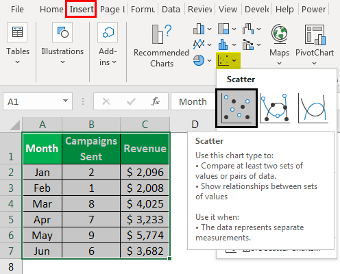
2. Now, we will have the first look at the chart below.
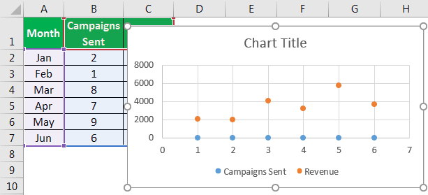
3. It is not a ready chart straightforward. Therefore, we need to make some settings with this chart. First, we must right-click on the chart and choose the “Select Data” option.
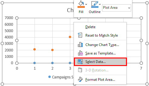
4. In the below window, select the “Campaigns Sent” column and hit the “Remove” option.
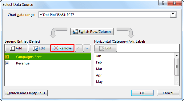
5. Select the “Revenue” column in the same window and click “Edit.”
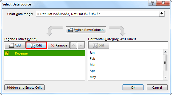
6. In the below window for “Series X Values,” choose “Campaigns Sent” data.
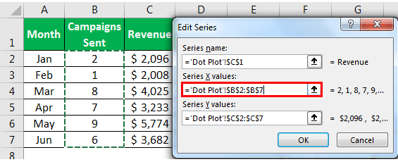
7. We get the following graph look.
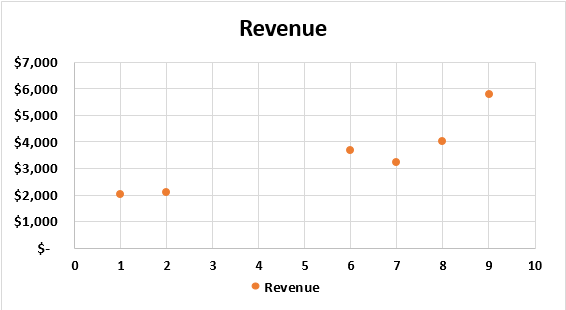
8. Now, click on a bubble to select and press Ctrl + 1 to open the "Format Data Series" dialog box to the right of the chart.
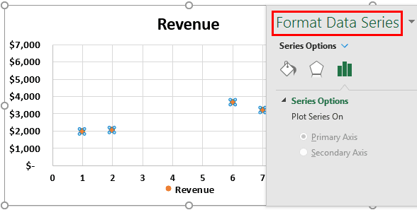
9. Click on "Effects" and "3-D Format."
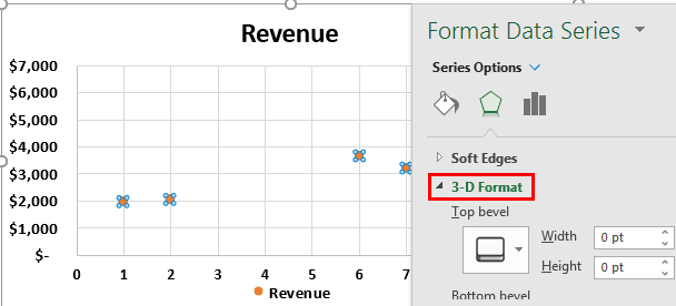
10. Under "3-D Format", select circle, and type Top Bevel.
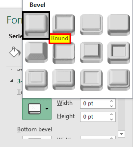
11. Now go to "Fill" and "Line" and choose "Marker".
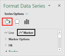
12. Under the option of “Marker,” choose “Vary Colours by Point.” It will add different kinds of colors to each bubble. Then in the same option, go to Marker Options > Built-in, and the Size = 25.
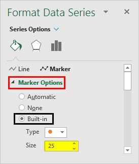
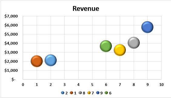
13. Now, every bubble increases in size and has different colors.
14. Now, select the chart. We will see the plus icon to the right of the chart. It will open up “Chart Elements.” Next, click on “Axis Titles.” Now, we can see both a horizontal and vertical axis. In addition, we can see the “Axis Title” default value.
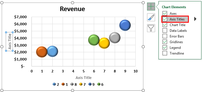
15. Type the vertical axis text as “Revenue” on the vertical axis. On the horizontal axis, type the text as “Campaigns.”
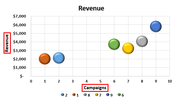
16. Change the chart heading to Campaigns vs. Revenue.
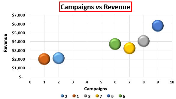
Now that our 3D scatter plot is ready in Excel. Let us interpret the numbers from this chart. The first bubble represents the month of January. This month, the campaign sent was 2, and the revenue generated was $2,096. The second one is in February. Now, we can see a slight impact of the campaign on revenue here. In February, the total campaign sent was just 1, and revenue was $2,008.
Now, look at the third bubble for March month. This month’s total campaign sent number is 8, and revenue increased to $4,025. This chart shows a relationship between campaigns sent and revenue generated.
So, the bottom line is that when the number of campaigns sent increases, revenue generation also increases.
Things to Remember
- The 3D scatter plot chart in Excel is mainly used to show the relationship between two sets of data related to each other.
- The scattered chart has X and Y variables.
- This chart helps show related data like rainfall vs. umbrellas sold, rainfall vs. crops sold, and advertisement vs. revenue.

